Read the article on Medium for betting understanding of how it works under the hood
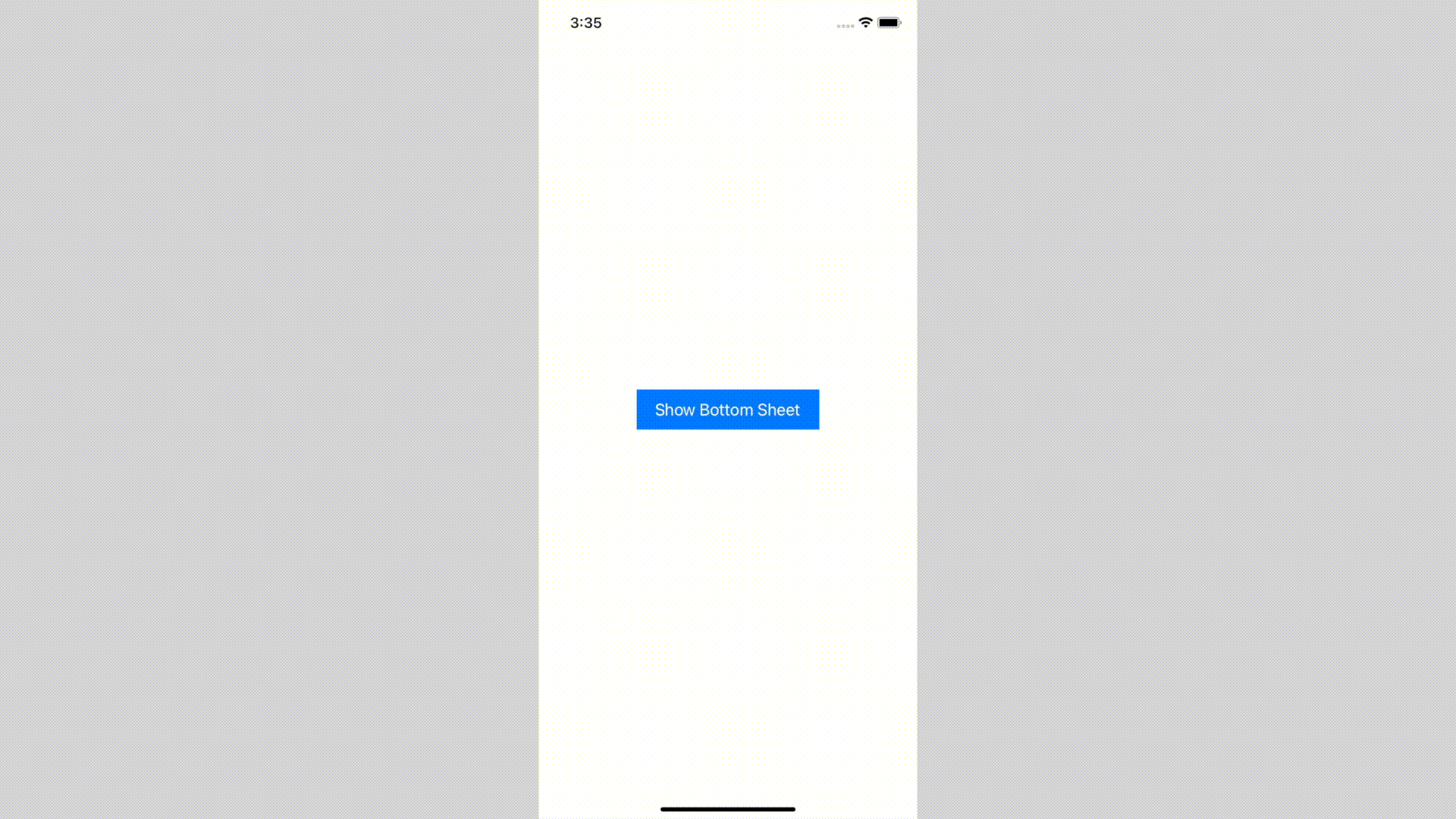
Bottom Sheet component is designed to handle any content, including a scrolling one.
- use any content size, and it will adapt
- use scrollable content:
UICollectionView,UITableVieworUIScrollView - dismiss interactively by swipe-down or just tapping on an empty space
- build flows inside using
BottomSheetNavigationController- supports all system transitions: push and (interactive) pop
- transition animated between different content sizes
- Customize appearance:
- pull bar visibility
- corner radius
- shadow background color
How it looks like
| Adapts to content size | Interactive dismissal |
|---|---|
 |
|
NavigationController inside Bottom Sheet
| Push and pop transitions | Interactive pop transition |
|---|---|
 |
 |
Installation
Swift Package Manager
To integrate Bottom Sheet into your Xcode project using Swift Package Manager, add it to the dependencies value of your Package.swift:
                                                dependencies: [

.package(url: “https://github.com/joomcode/BottomSheet”, from: “2.0.0”)

]
CocoaPods
CocoaPods is a dependency manager for Cocoa projects. You can install it with the following command:
$ bundle install
To integrate BottomSheet into your Xcode project using CocoaPods, specify it in your Podfile:
                                                source ‘https://github.com/CocoaPods/Specs.git’

use_frameworks!
target ‘<Your Target Name>’ do

pod ‘BottomSheet’, :git => ‘https://github.com/joomcode/BottomSheet’

end
Getting started
This repo contains demo, which can be a great start for understanding Bottom Sheet usage, but here are simple steps to follow:
- Create
UIViewControllerto present and set content’s size by preferredContentSize property - (optional) Conform to ScrollableBottomSheetPresentedController if your view controller is list-based
- Present by using presentBottomSheet(viewController:configuration:)
If you want to build flows, use BottomSheetNavigationController
                                                presentBottomSheetInsideNavigationController(

viewController: viewControllerToPresent,

configuration: .default

)
You can customize appearance passing configuration parameter
                                                presentBottomSheet(

viewController: viewControllerToPresent,

configuration: BottomSheetConfiguration(

cornerRadius: 10,

pullBarConfiguration: .visible(.init(height: 20)),

shadowConfiguration: .init(backgroundColor: UIColor.black.withAlphaComponent(0.6))

),

canBeDismissed: {

// return `true` or `false` based on your business logic

true

},

dismissCompletion: {

// handle dismiss completion if user closed bottom sheet by a gesture

}

)
Resources
GitHub
#bottomsheet #ios #swift #swiftpackagemanager


- July 4, 2025
- Mins Read

- July 4, 2025
- Mins Read

- July 4, 2025
- Mins Read

- July 4, 2025
- Mins Read
- July 4, 2025
- Mins Read
