
- August 28, 2025
- Mins Read
Maintainer(s): @nickm01 @pmacro @aryamansharda
Simple and customizable button in Swift.
Installation
Cocoapods
pod ‘SwiftyButton’
Carthage
github ‘TakeScoop/SwiftyButton’
Usage
Flate Button

                                                let button = FlatButton()

button.color = .cyan

button.highlightedColor = .blue

button.cornerRadius = 5
Pressable Button

                                                let button = PressableButton()

button.colors = .init(button: .cyan, shadow: .blue)

button.shadowHeight = 5

button.cornerRadius = 5
All Properties
Here is a list of all the properties that you can modify. Those are all editable directly from Interface Builder. See FlatButton.Defaults or PressableButton.Defaults to set defaults for those properties.
FlateButton
                                                button.color = .cyan

button.highlightedColor = .cyan

button.selectedColor = .blue

button.disabledButtonColor = .gray

button.cornerRadius = 8
PressableButton
                                                button.colors = .init(button: .cyan, shadow: .blue)

button.disabledColors = .init(button: .gray, shadow: .darkGray)

button.shadowHeight = 10

button.cornerRadius = 8

button.depth = 0.5 // In percentage of shadowHeight
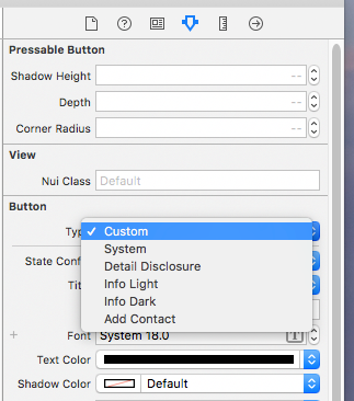
Interface Builder (Storyboard/XIB)
Add a UIButton as usual, then:
- Modify the underlying class to
FlatButton/PressableButton, and that the module is set toSwiftyButton - Make sure that the button type is set to
Custom

Defaults
You can set defaults that will be applied for any new instance of SwiftyButton by modifying the FlatButton.Defaults or PressableButton.Defaults structure:
                                                FlatButton.Defaults.color = .cyan

PressableButton.Defaults.cornerRadius = 8

…
Custom Content

Use CustomPressableButton to add custom content in a Swifty Button.
This is a subclass of SwiftyButton that exposes a content view that moves when the button state changes. All you have to do is add your views inside button.contentView and setup layout constraints relative to this view.
Install
pod `SwiftyButton/CustomContent`
Usage
Here is how you would create a button similar to the one above (here we used PureLayout for constraints):
                                                let button = CustomPressableButton()
let indicator = UIActivityIndicatorView(activityIndicatorStyle: .white)

button.contentView.addSubview(indicator)

indicator.autoPinEdgesToSuperviewEdges(with: UIEdgeInsets(top: 10, left: 15, bottom: 10, right: 0), excludingEdge: .right)

indicator.startAnimating()
let label = UILabel()

button.contentView.addSubview(label)

label.autoPinEdgesToSuperviewEdges(with: UIEdgeInsets(top: 10, left: 0, bottom: 10, right: 10), excludingEdge: .left)

label.autoPinEdge(.left, to: .right, of: indicator, withOffset: 10)

label.text = “Loading…”

label.textColor = .white
Know limitations
PressableButtononly works with plain colors (no alpha / transparency) because of the way its background image is rendered. See #2PressableButtonmanages title and image insets automatically (titleEdgeInsetsandimageEdgeInsets). See #5- User-specified inset values for
topandbottomwill be overridden. - You may specify inset values for
leftandright.
- User-specified inset values for
More examples
Look at the Examples folder to see more button examples.
GitHub
#ios #swift #uibutton #uikit
YOU MIGHT ALSO LIKE...

- August 27, 2025
- SwiftUI
This package provides you with an easy way to show tooltips over any SwiftUI view, since Apple does not provide ...
- August 27, 2025
- SwiftUI
- Uncategorized
SimpleToast is a simple, lightweight, flexible and easy to use library to show toasts / popup notifications inside iOS or ...
- August 27, 2025
- SwiftUI
Create Toast Views with Minimal Effort in SwiftUI Using SSToastMessage. SSToastMessage enables you to effortlessly add toast notifications, alerts, and ...

- August 27, 2025
- Mins Read
- August 27, 2025
- Mins Read
- August 27, 2025
- Mins Read
- August 22, 2025
- Mins Read
