- August 28, 2025
- Mins Read

⭐️Features
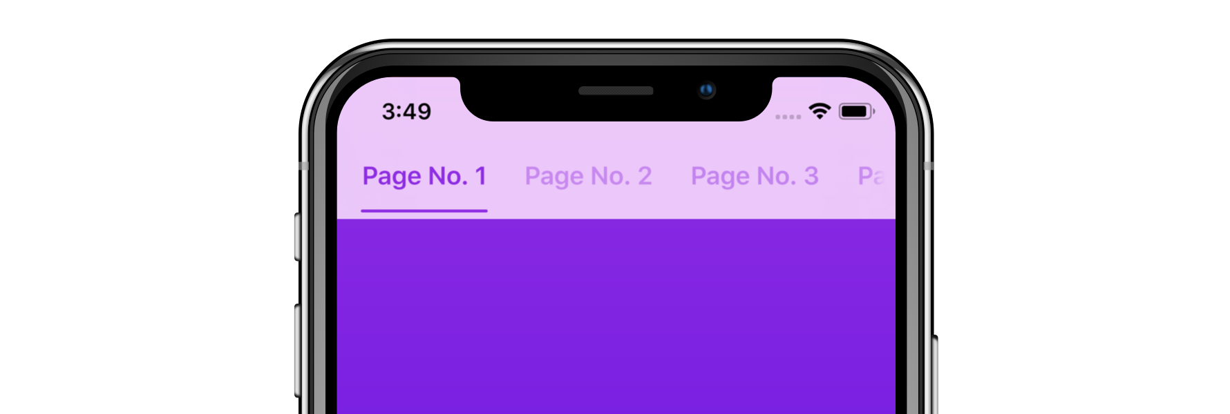
- Easy to implement page view controller with interactive indicator bars.
- Highly adaptable and powerful customization.
- Fully extensible with mix-and-match component library.
- Built on Pageboy, a simple, informative page view controller.
- Automatically insets child view controller contents.
📋Requirements
Tabman requires iOS 11 or above; and is compatibile with Swift 5.
📲Installation
Swift Package Manager
Tabman is compatible with Swift Package Manager and can be integrated via Xcode.
CocoaPods
Tabman is also available through CocoaPods:
pod ‘Tabman’, ‘~> 3.0’
Carthage
Tabman is also available through Carthage:
github “uias/Tabman” ~> 3.0
🚀Usage
The Basics
- Set up your view controller with the an array of view controllers that you want to appear.
- Set the
PageboyViewControllerDataSourcedata source of theTabmanViewController. - Create, customize and add as many
TMBars as you want.
                                                import Tabman

import Pageboy
class TabViewController: TabmanViewController {
private var viewControllers = [UIViewController(), UIViewController()]
override func viewDidLoad() {

super.viewDidLoad()
self.dataSource = self
// Create bar

let bar = TMBar.ButtonBar()

bar.layout.transitionStyle = .snap // Customize
// Add to view

addBar(bar, dataSource: self, at: .top)

}

}
When adding a bar, you can choose to add it to the predefined areas (.top, .bottom, .navigationItem(item:)) or to a custom view with .custom(view:layout:). For more information, read the Adding a Bar guide.
- Configure your data sources.
                                                extension TabViewController: PageboyViewControllerDataSource, TMBarDataSource {
func numberOfViewControllers(in pageboyViewController: PageboyViewController) -> Int {

return viewControllers.count

}
func viewController(for pageboyViewController: PageboyViewController,

at index: PageboyViewController.PageIndex) -> UIViewController? {

return viewControllers[index]

}
func defaultPage(for pageboyViewController: PageboyViewController) -> PageboyViewController.Page? {

return nil

}
func barItem(for bar: TMBar, at index: Int) -> TMBarItemable {

let title = “Page \(index)”

return TMBarItem(title: title)

}

}
Bar Items
A bar will ask for a TMBarItemable for each page that is provided to the TabmanViewController dataSource. TMBarItemable is a protocol that can be used for custom item types, the default in Tabman being TMBarItem:
                                                let item = TMBarItem()

item.title = “Item 1”

item.image = UIImage(named: “item.png”)

item.badgeValue = “New”
UIKit Itemables
Tabman also provides support for some native UIKit types as TMBarItemable:
UINavigationItemUITabBarItem
These types are unfortunately unable to support the dynamic updating of the bar when setting properties.
Choosing a look
Tabman provides numerous, easy to use template styles out of the box:

Tabman provides numerous, easy to use template styles out of the box:
                                                let bar = TMBar.ButtonBar()

let tabBar = TMBar.TabBar()
Customization
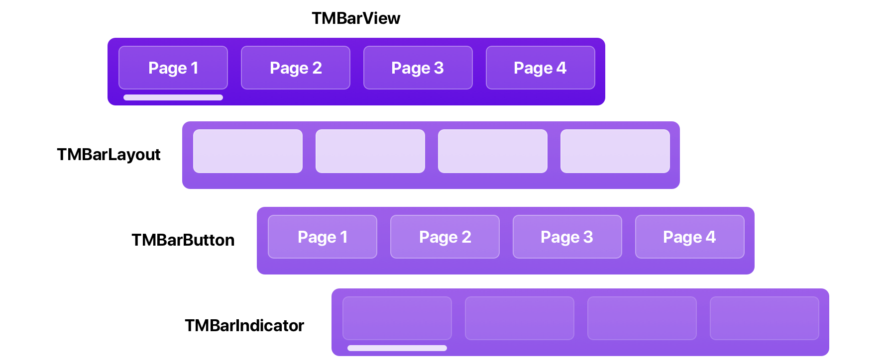
Bar customization is available via properties on each functional area of the bar. Each bar is made up of 4 distinct areas:

TMBarView
TMBarView is the root view of every bar, and provides the glue for meshing all the other functional areas together. You can change a few things here, such as background style and transitioning behavior.
                                                bar.background.style = .blur(style: .extraLight)

bar.transitionStyle = .snap
This is also the entry point for all other customization.
🧲 Properties of Interest
backgroundView–TMBarBackgroundViewwhich provides background styling.scrollMode– What type of interactive scrolling to allow.fadesContentEdges– Whether to fade the edges of the bar contents as it goes off-screen.
More: TMBarView Docs
TMBarLayout
TMBarLayout is the foundation of a TMBarView, dictating how bar buttons are displayed and laid out. Look here if you want to change things such as button spacing, content insets and other layout’y things.
bar.layout.contentInset = UIEdgeInsets(top: 0.0, left: 20.0, bottom: 0.0, right: 20.0)
🧲 Properties of Interest
contentMode– How the layout should display its contents; either restricted to the bar width with.fitor intrinsically sized with.intrinsic.contentInset– Inset to be applied to the edges of the layout.transitionStyle– How the layout should perform transition animations.alignment– How the layout should be aligned in the bar.
More: TMBarLayout Docs
TMBarButton
TMBarButton views are populated in the TMBarLayout and correspond to the items provided by the data source. This is the place to change things like fonts, image sizing and highlight colors.
As you will most likely dealing with more than one button, you can modify the whole set at once:
                                                bar.buttons.customize { (button) in

button.tintColor = .orange

button.selectedTintColor = .red

}
This will be applied to both existing bar buttons and any that are added to the bar afterwards.
🧲Properties of Interest
backgroundView–TMBarBackgroundViewwhich provides background styling.contentInset– Inset to be applied to the edges of the button.transitionStyle(TMBarButtonCollection) – How the buttons should should perform transition animations.badge–TMBadgeViewthat displaysbadgeValuefrom bar item.
More: TMBarButton Docs
TMBarIndicator
Lastly is TMBarIndicator – which indicates the current page index status for the bar. You can change behavior characteristics here as well as how the indicator looks.
                                                bar.indicator.overscrollBehavior = .compress

bar.indicator.weight = .heavy
🧲 Properties of Interest
overscrollBehavior– How the indicator should handle scrolling beyond the bounds of the bar items.isProgressive– Whether the indicator should act progressively when transitioning through page indexes.transitionStyle– How the indicator should should perform transition animations.
More: TMBarIndicator Docs
🎨Advanced Customization
Tabman provides the complete freedom to mix-and-match the built-in components; and also define your own.
TMBarView leverages generics to define and serve the three distinct functional areas of the bar. This means…
                                                // …that the preset…

let bar = Bar.ButtonBar()
// …is actually under the hood:

let bar = BarView<HorizontalBarLayout, LabelBarButton, LineBarIndicator>
So swapping in another type of layout, button or indicator could not be simpler.
Lets say you wanted to actually use a DotBarIndicator rather than the LineBarIndicator:
let bar = BarView<HorizontalBarLayout, LabelBarButton, DotBarIndicator>
The following components are available in Tabman:
Bar Layouts
TMHorizontalBarLayout– Layout that displays bar buttons sequentially along the horizontal axis.TMConstrainedHorizontalBarLayout– Layout that displays bar buttons sequentially along the horizontal axis, but is constrained by the number of items it can display.
Bar Buttons
TMLabelBarButton– Button which contains a single text label.TMTabItemBarButton– Button which mimics appearance of aUITabBarItem, containing a image and label vertically aligned.TMBarButton.None– Display no visible bar buttons.
Bar Indicators
TMLineBarIndicator– Simple indicator that displays as a horizontal line.TMChevronBarIndicator– Indicator that displays a vertical chevron centered along the X-axis.TMBlockBarIndicator– Indicator that fills the bar, displaying a solid color.TMDotBarIndicator– Indicator that displays a circular dot centered along the X-axis.TMBarIndicator.None– Display no visible indicator.
Going Completely Custom
As replacing the type of layout, button or indicator is as easy as above; you have the ability to define your own subclasses without too much of a headache.
There are also example projects that showcase custom layouts and such:
- Tinderbar – Tinder iOS app layout built with Tabman.
📐Content Insetting
Tabman automatically adjusts any content in its child view controllers so that it displays correctly beneath any visible bars. It provides the following behaviors:
- Updates
contentInsetandcontentOffsetappropriately for anyUIScrollViewor derived subclass found in the child view controller’s subviews. - Sets
additionalSafeAreaInsetsto reflect the required safe areas including the bar contents. Any views constrained to the safe area in the child view controller will be laid out correctly (Only available in iOS 11 and above.)
TabmanViewController also provides barLayoutGuide, a UILayoutGuide that provides top and bottom anchors taking into account any bars added to the .top or .bottom TabmanViewController.BarLocation areas. The raw UIEdgeInsets are also available via .barInsets.
Auto insetting can be disabled by setting automaticallyAdjustsChildInsets to false – however this must be done before viewDidLoad.
Tabman will not provide any insetting behavior for bars that are added to custom views.
⚠️Troubleshooting
If you are encountering issues with Tabman, please check out the Troubleshooting Guide.
If you’re still having problems, feel free to raise an issue.
GitHub
- August 27, 2025
- SwiftUI
This package provides you with an easy way to show tooltips over any SwiftUI view, since Apple does not provide ...
- August 27, 2025
- SwiftUI
- Uncategorized
SimpleToast is a simple, lightweight, flexible and easy to use library to show toasts / popup notifications inside iOS or ...
- August 27, 2025
- SwiftUI
Create Toast Views with Minimal Effort in SwiftUI Using SSToastMessage. SSToastMessage enables you to effortlessly add toast notifications, alerts, and ...


