- August 28, 2025
- Mins Read
Simple battery shaped UIView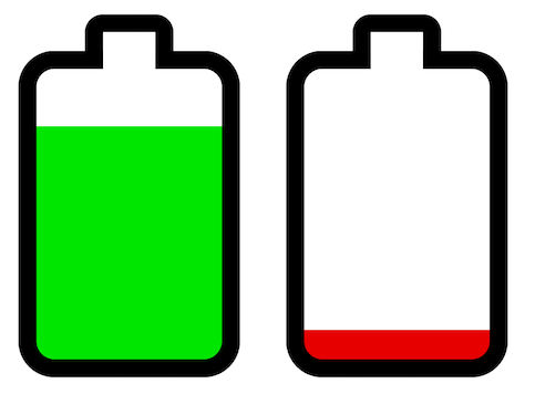
                                                let batteryView = BatteryView(frame: smallRect)

batteryView.level = 42 // anywhere in 0…100

batteryView.lowThreshold = 25 // battery fill becomes red if level is below this threshold

batteryView.gradientThreshold = 50 // battery fill gradually changes from green to red below this threshold
SwiftUI Usage
BatteryShape(level: $level)
Changing Appearance
The properties below can be set in Interface Builder, in code, or through a UIAppearance proxy (e.g., BatteryView.appearance().borderColor = .gray). When using SwiftUI you can set them in the BatteryShape initializer .
Colors:
                                                batteryView.borderColor = .darkGray

batteryView.highLevelColor = .green

batteryView.lowLevelColor = .red

batteryView.noLevelColor = .gray

batteryView.noLevelText = “?” // shown over battery when the level is undefined or out of bounds
Battery Shape:
                                                batteryView.direction = .minXEdge // terminal facing left
batteryView.terminalLengthRatio = 0.1 // relative to battery length

batteryView.terminalWidthRatio = 0.4 // relative to battery width
batteryView.borderWidth = 2.5 // default is batteryLength / 20

batteryView.cornerRadius = 5 // default is batteryLength / 10
CocoaPods:
pod ‘BatteryView’
YOU MIGHT ALSO LIKE...

- August 27, 2025
- SwiftUI
This package provides you with an easy way to show tooltips over any SwiftUI view, since Apple does not provide ...
- August 27, 2025
- SwiftUI
- Uncategorized
SimpleToast is a simple, lightweight, flexible and easy to use library to show toasts / popup notifications inside iOS or ...
- August 27, 2025
- SwiftUI
Create Toast Views with Minimal Effort in SwiftUI Using SSToastMessage. SSToastMessage enables you to effortlessly add toast notifications, alerts, and ...

- August 27, 2025
- Mins Read
- August 27, 2025
- Mins Read
- August 27, 2025
- Mins Read
- August 22, 2025
- Mins Read
