
- August 28, 2025
- Mins Read
Present Apple-like alert & toast in SwiftUI
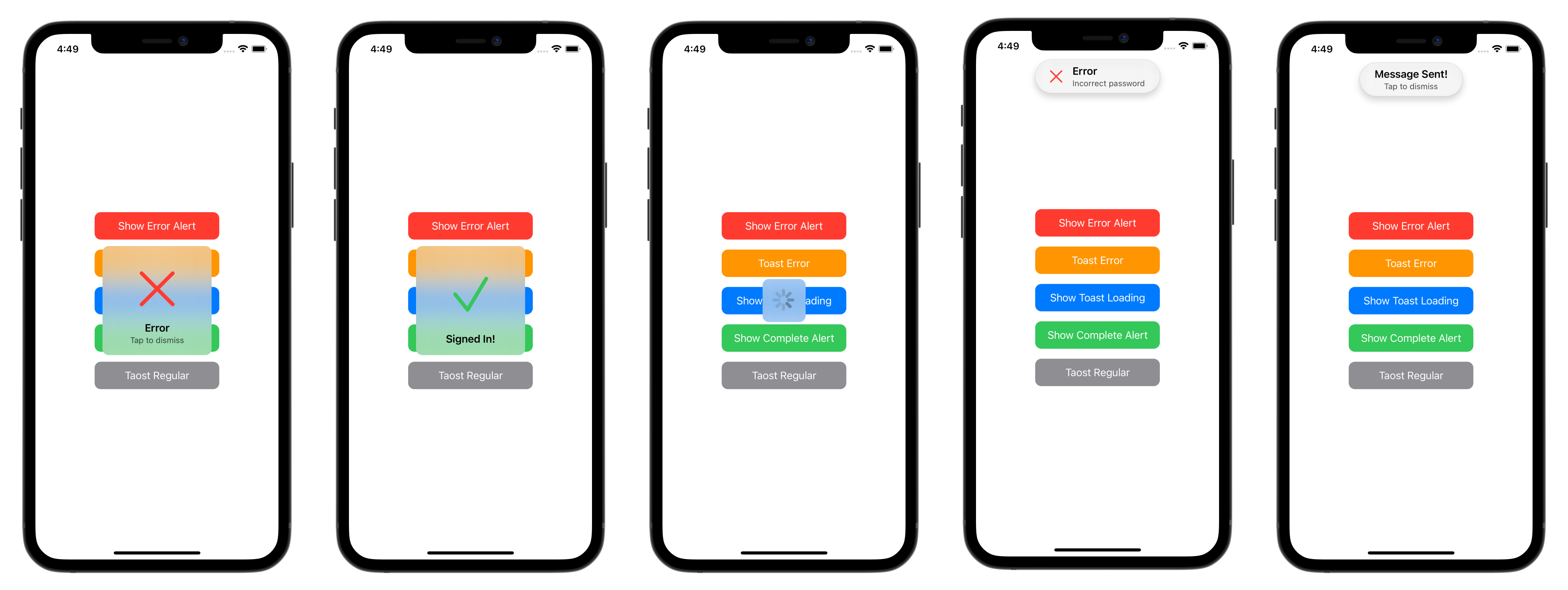
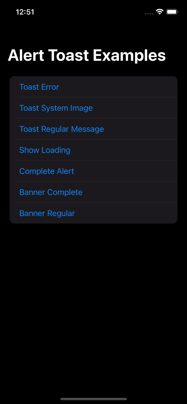
🌄 Example
🔭 Overview
Currently in SwiftUI, the only way to inform the user about some process that finished for example, is by using Alert. Sometimes, you just want to display a message that tells the user that something has completed or that their message was sent. Apple doesn’t provide any method other than using Alert, even though they use various types of pop-ups. This results in poor UX, as the user must tap ‘OK’ or ‘Dismiss’ for every piece of information they should be notified aboutAlert Toast is an open-source library in Github to use with SwiftUI. It allows you to present popups that don’t need any user action to dismiss or to validate. Some great usage examples: Message Sent, Poor Network Connection, Profile Updated, Logged In/Out, Favorited, Loading and so on…
- Built with pure SwiftUI.
- 3 Display modes:
Alert(pop at the center),HUD(drop from the top) andBanner(pop/slide from the bottom). Complete,ErrorSystemImage,Image,Loading, andRegular(Only Text).- Supports Light & Dark Mode.
- Works with any kind of view builder.
- Localization support.
- Font & Background customization.
If you like the project, don’t forget to
put star 🌟₿ Bitcoin donation address:
0xec48bfa813a773fa2394aec23f97da5cb4d5ff02
- Send only BTC to this deposit address.
- Ensure the network is BNB Smart Chain (BEP20).
Navigation
-
Installation
- CocoaPods
- Swift Package Manager
- Manually
-
Usage
- Usage example with regular alert
- Complete Modifier Example
- Alert Toast Parameters
- Article
- Contributing
- Author
- License
💻 Installation
Cocoapods
AlertToast Cocapods Website
CocoaPods is a dependency manager for Cocoa projects. For usage and installation instructions, visit their website. To integrate AlertToast into your Xcode project using CocoaPods, specify it in your Podfile:
pod ‘AlertToast’
Swift Package Manager
The Swift Package Manager is a tool for managing the distribution of Swift code. It’s integrated with the Swift build system to automate the process of downloading, compiling, and linking dependencies.
To integrate AlertToast into your Xcode project using Xcode 12, specify it in File > Swift Packages > Add Package Dependency...:
https://github.com/elai950/AlertToast.git, :branch=”master”
For Xcode 13, please refer this article to install AlertToast
Manually
If you prefer not to use any of dependency managers, you can integrate AlertToast into your project manually. Put Sources/AlertToast folder in your Xcode project. Make sure to enable Copy items if needed and Create groups.
🧳 Requirements
- iOS 13.0+ | macOS 11+
- Xcode 12.0+ | Swift 5+
🛠 Usage
First, add import AlertToast on every swift file you would like to use AlertToast.
Then, use the .toast view modifier:
Parameters:
isPresenting: (MUST) assign aBinding<Bool>to show or dismiss alert.duration: default is 2, set 0 to disable auto dismiss.tapToDismiss: default istrue, setfalseto disable.alert: (MUST) expectsAlertToast.
Usage example with regular alert
                                                import AlertToast

import SwiftUI
struct ContentView: View{
@State private var showToast = false
var body: some View{

VStack{
Button(“Show Toast”){

showToast.toggle()

}

}

.toast(isPresenting: $showToast){
// `.alert` is the default displayMode

AlertToast(type: .regular, title: “Message Sent!”)
//Choose .hud to toast alert from the top of the screen

//AlertToast(displayMode: .hud, type: .regular, title: “Message Sent!”)
//Choose .banner to slide/pop alert from the bottom of the screen

//AlertToast(displayMode: .banner(.slide), type: .regular, title: “Message Sent!”)

}

}

}
Complete Modifier Example
                                                .toast(isPresenting: $showAlert, duration: 2, tapToDismiss: true, alert: {

//AlertToast goes here

}, onTap: {

//onTap would call either if `tapToDismis` is true/false

//If tapToDismiss is true, onTap would call and then dismis the alert

}, completion: {

//Completion block after dismiss

})
Alert Toast Parameters
                                                AlertToast(displayMode: DisplayMode,

type: AlertType,

title: Optional(String),

subTitle: Optional(String),

style: Optional(AlertStyle))
//This is the available customizations parameters:

AlertStyle(backgroundColor: Color?,

titleColor: Color?,

subTitleColor: Color?,

titleFont: Font?,

subTitleFont: Font?)
Available Alert Types:
- Regular: text only (Title and Subtitle).
- Complete: animated checkmark.
- Error: animated xmark.
- System Image: name image from
SFSymbols. - Image: name image from Assets.
- Loading: Activity Indicator (Spinner).
Alert dialog view modifier (with default settings):
.toast(isPresenting: Binding<Bool>, duration: Double = 2, tapToDismiss: true, alert: () -> AlertToast , onTap: () -> (), completion: () -> () )
Simple Text Alert:
AlertToast(type: .regular, title: Optional(String), subTitle: Optional(String))
Complete/Error Alert:
AlertToast(type: .complete(Color)/.error(Color), title: Optional(String), subTitle: Optional(String))
System Image Alert:
AlertToast(type: .systemImage(String, Color), title: Optional(String), subTitle: Optional(String))
Image Alert:
AlertToast(type: .image(String), title: Optional(String), subTitle: Optional(String))
Loading Alert:
                                                //When using loading, duration won’t auto dismiss and tapToDismiss is set to false

AlertToast(type: .loading, title: Optional(String), subTitle: Optional(String))
You can add many .toast on a single view.
GitHub
#apple #swift #xcode
YOU MIGHT ALSO LIKE...

- August 27, 2025
- SwiftUI
This package provides you with an easy way to show tooltips over any SwiftUI view, since Apple does not provide ...
- August 27, 2025
- SwiftUI
- Uncategorized
SimpleToast is a simple, lightweight, flexible and easy to use library to show toasts / popup notifications inside iOS or ...
- August 27, 2025
- SwiftUI
Create Toast Views with Minimal Effort in SwiftUI Using SSToastMessage. SSToastMessage enables you to effortlessly add toast notifications, alerts, and ...

- August 27, 2025
- Mins Read
- August 27, 2025
- Mins Read
- August 27, 2025
- Mins Read
- August 22, 2025
- Mins Read
