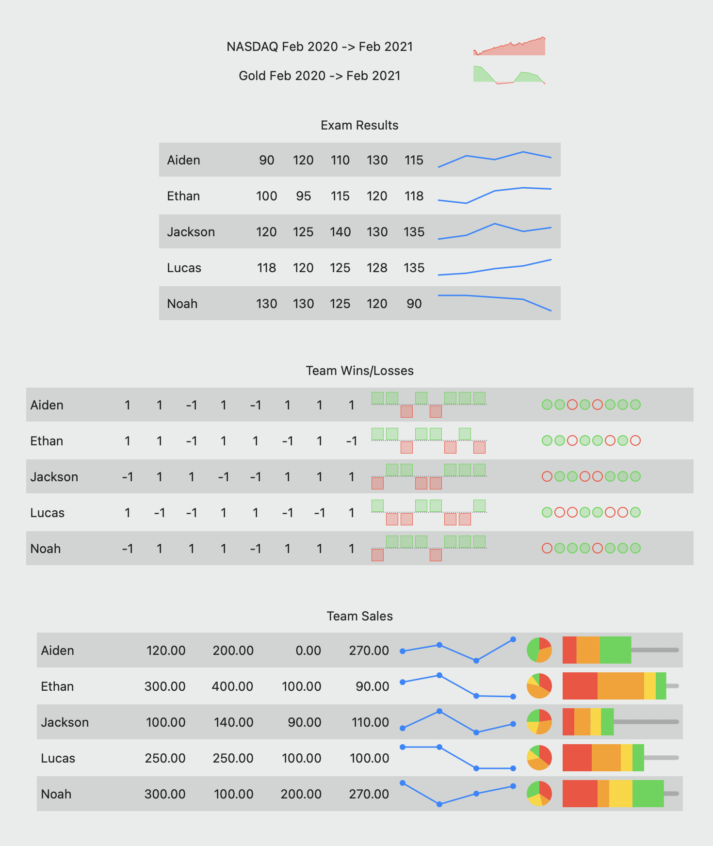
Sparklines id graph for every thing you need

A lightweight sparkline component, supporting Swift, SwiftUI, macCatalyst and Objective-C.
What is a sparkline?
A sparkline is a very small chart, typically drawn without axes or coordinates. It presents the general shape of the variation (typically over time) in some measurement, such as temperature or stock market price, in a simple and highly condensed way. Sparklines are small enough to be embedded in text, or several sparklines may be grouped together as elements of a small multiple. Whereas the typical chart is designed to show as much data as possible, and is set off from the flow of text, sparklines are intended to be succinct, memorable, and located where they are discussed.
Source: Wikipedia
What ISN’T a sparkline?
DSFSparkline IS NOT designed to be a full-featured graphing library. It was built to be lightweight, to create small, memorable charts within an app.
If you need features like labelling, real-time updating, axis-labelling, interactivity, legends or beautiful charts at larger sizes, you might be better served by the Charts library, Core plot or SciChart (paid). You can find a whole lot more here.
Features
- Multiple graph styles support, such as line, bar, tablet etc.
- Support for sparkline customizations, such as zero-line, grid lines, highlighting.
- Prebuilt NSView/UIView/SwiftUI types for quick integration
- Independently scalable for sparklines at any size
- y-range can automatically grow or shrink to encompass the full y-range of data.
- y-range can be fixed and the sparkline will truncate to the specified range
- SwiftUI support for all sparkline types
- NSAttributedString support
IBDesignable support for prebuilt types so you can see and configure your sparklines in interface builder.- Optional drawing of a ‘zero line’ on the bar and line graphs (thanks Tito Ciuro)
- Playground support
TL;DR – Show me something!
Create a retina-scale (144dpi) bitmap with a simple line overlay graph

Create a Swift-UI line graph sparkline with zero-line and highlight range overlays

Integration
Use Swift Package Manager to integrate DSFSparkline into your project
Add https://github.com/dagronf/DSFSparkline to your project.
Note
When adding DSFSparkline to one of your projects, you need to choose a SINGLE ‘package product’ to link to your target. Choosing multiple package products for your project will result in weird, inconsistent link errors.
| Package Product |
Description |
DSFSparkline |
The default style. If you are just trying this library out, this is the one to choose |
DSFSparkline-static |
Add DSFSparkline as a STATIC library, meaning that all DSFSparkline code is linked directly into your target |
DSFSparkline-shared |
Add DSFSparkline as a SHARED library, meaning that you can use a single shared framework between multiple targets in your project to save space |

Available graph types
                                                /// Swift

dataSource.windowSize = 30

assert(dataSource.windowSize == 30)
Y-range
The range defines the upper and lower values to be displayed in the sparkline. Any values pushed into the datasource will be capped when drawn to this range.
If the range is not set (ie nil), then any overlays will automatically resize to fit the entire range of values within the source. For example, with values as [1, 2, 3, 4] the range is implicitly set as 1 … 4. If the values are [-10, 100, 33] the range is implicitly set as -10 … 100
                                                /// Swift

dataSource.range = -1.0 … 1.0
The zero-line defines the point the sparkline overlays should consider to be ‘zero’. For example, graphs that can be centered (line, bar and stackline) use the zero-line value to define where the graph is centered around.
The zero-line value defaults to zero.
You can draw a zero-line for a sparkline by adding a DSFSparklineOverlay.ZeroLine to your surface.
                                                /// Swift

dataSource.zeroLineValue = 0.2
You can push new values into the datasource using the push functions. Values in the datasource older than the datasource’s windowSize are discarded.
As values are pushed into the datasource, any overlays assigned this datasource will automatically update.
                                                /// Swift

dataSource.push(value: 4.5)

dataSource.push(values: [6, 7, 8])
DSFSparkline.StaticDataSource
A datasource that contains a static set of values. Some types of sparkline use a single ‘set’ of data, providing no historical context.
                                                /// Swift

let dataSource = DSFSparkline.StaticDataSource([1, 2, 3])w
Overlays
Overlays represent the individual visual components of a sparkline. You can add as many or as few to your surface in any order. For example, you could overlay two different graph types onto the same surface using the same. And as overlays can share their datasource, all overlays using the same source will automatically update if the data changes (for example, in reponse to a push)
For example, there is an overlay that highlights a y-range of data. Or, if you want some grid lines, you can add them using the gridlines overlay.
You can add different instances of an overlay to the same sparkline. For example, if you want to add multiple range highlights you add multiple ‘highlight’ overlays to the sparkline surface.
The order in which the overlays are added determine where in the z-order that they appear in the sparkline. For example, you can choose to draw the grid on top of the graph if you want by adding the graph overlay BEFORE you add the grid overlay

The overlay allows your sparkline to be as complex or as simple as you want.
Graph types
Dynamic
A dynamic graph automatically updates its overlays as values are ‘pushed’ onto its datasource. As data is added the assigned overlay is automatically updated to reflect the new data. If more data is added via a push or set the data is added to the datasource, the associated view will automatically update to reflect the new data. Older data that no longer falls within the datasource window is discarded.
This provides the ability to show a historical data set over the breadth of the graph.
`DSFSparklineOverlay.StackLine` 
`DSFSparklineOverlay.Bar` 
`DSFSparklineOverlay.Dot` 
`DSFSparklineOverlay.WinLossTie` 
`DSFSparklineOverlay.Tablet` 
`DSFSparklineOverlay.Stripes` 
Static
A static graph has a fixed set of values (for example, a pie chart). The overlays update when a new static data source is assigned to it.
`DSFSparklineOverlay.Pie` 
`DSFSparklineOverlay.DataBar` 
`DSFSparklineOverlay.PercentBar` 

`DSFSparklineOverlay.WiperGauge` 
`DSFSparklineOverlay.ActivityGrid` 
`DSFSparklineOverlay.CircularGauge` 
Component types
A component represents an overlay that isn’t a graph in itself. Examples are grid lines, zero-lines, highlights etc. A component uses the same datasource so that it aligns with the graph it is associated with.
| Name |
Description |
DSFSparklineOverlay.ZeroLine |
Draw a horizontal line at the ‘zero-line’ position of the sparkline. The zero-line is defined by the datasource and is by default zero, however this can be changed. |
DSFSparklineOverlay.RangeHighlight |
Highlight a range of y-values on the sparkline |
DSFSparklineOverlay.GridLines |
Draw lines at specified y-values on the sparkline |
Using prebuilt views
DSFSparkline has a number of ‘prebuilt’ sparkline views available with a more limited scope, designed to be quicker to add to your project.
Every prebuilt sparkline view has a SwiftUI companion view.
Available prebuilt type
DSFSparklineLineGraphView / DSFSparklineLineGraphView.SwiftUIDSFSparklineStackLineGraphView / DSFSparklineLineGraphView.SwiftUIDSFSparklineBarGraphView / DSFSparklineBarGraphView.SwiftUIDSFSparklineStripesGraphView / DSFSparklineStripesGraphView.SwiftUIDSFSparklineDotGraphView / DSFSparklineDotGraphView.SwiftUIDSFSparklineWinLossGraphView / DSFSparklineWinLossGraphView.SwiftUIDSFSparklineTabletGraphView / DSFSparklineTabletGraphView.SwiftUIDSFSparklinePieGraphView / DSFSparklinePieGraphView.SwiftUIDSFSparklineDataBarGraphView / DSFSparklineDataBarGraphView.SwiftUIDSFSparklinePercentBarGraphView / DSFSparklinePercentBarGraphView.SwiftUIDSFSparklineWiperGaugeGraphView / DSFSparklineWiperGaugeGraphView.SwiftUIDSFSparklineActivityGridView / DSFSparklineActivityGridView.SwiftUIDSFSparklineCircularGaugeView / DSFSparklineCircularGaugeView.SwiftUI
Sample Swift code
Sample SwiftUI code
Prebuilt customizations
Screenshots
In app
| macOS dark |
macOS light |
iOS |
 |
 |
 |
Interface Builder
| macOS |
tvOS |
 |
 |
SwiftUI

NSAttributedString support

Animated

- Removed support for macOS 10.11, 10.12
- Removed support for iOS 13, tvOS 13
- Removed CocoaPods support (if you need Cocoapods, stick with v6).
6.0.0
- Added CircularGauge, CircularProgress sparkline types
- Removed support for
@IBDesignable and @IBInspectable from the NSView/UIView implementations, as Xcode has indicated that it will be dropping support in the near future
5.2.0
- Added grid-lines support for pre-built views (line, bar, stack) (NSView/UIView/SwiftUI)
5.1.0
5.0.0
4.6.0
- Added WiperGauge sparkline type
4.3.0
- Added the ability to custom-draw markers for the ‘line’ sparkline type (raised issue)
- Fixed a minor issue where insetting certain graph types to remove clipping (line with markers, bar) would mean that zeroline, highlight overlays and grids would be appear to be very slightly off.
4.2.0
- Added ‘percent bar’ sparkline type.
4.1.2
4.1.1
- Fixed gradient bucket count issue.
- Added AttributedString SwiftUI demo to the ReportView demo. Demo uses The SwiftUI Lab Attributed String with AppKit bug fix for width calculation.
4.1.0
- Embed sparklines in NSAttributedString.
4.0.0
Substantial re-architect of the drawing code (that used to be directly in the views) into overlays and surfaces that are far more flexible (for example, being able to draw a sparkline bitmap without having to create a view)
The previous view/swiftui types are still available – they have been rebuilt on using the new overlay scheme and are referred to in documentation as ‘prebuilt’ types. This allowed backwards compatibility with previous versions of the library. Note however that given that the prebuilt views have been re-written there is a possibility of slight visual differences.
3.7.0
3.6.1
- Fixed animations on iOS/tvOS
3.6.0
- Added pie chart, databar chart.
- Added ability to show data markers for line graphs
3.5.2
- Fixed Objective-C Demo app
- Added
snapshot method to the base sparkline view class to produce an NSImage/UIImage version of the sparkline for embedded sparklines in text etc.
3.5.1
3.5.0
- Added stackline sparkline type
- Added win/loss/tie sparkline type
- Added tablet sparkline type
3.4.0
- Added support for centering line and bar graphs around their zero-line value.
3.3.0
- Fixed issue where iOS background wasn’t being drawn correctly in some cases.
- Fixed rare crash where a line graph with < 2 points would crash.
3.2.0
- Changed the zero-line definition class to
DSFSparklineZeroLineDefinition for clarity.
- More documentation, especially around SwiftUI. Attempted to make the documentation clearer around drawing parameters.
3.1.0
- Add the ability to customize the zero-line display (Tito Ciuro)
- Changed
showZero to showZeroLine for consistency with the new zero-line display values
3.0.0
- Add the ability to set the ‘zero’ line value. Defaults to zero for backwards compatibility.
You can set where the ‘zero’ line draws via the zeroLineValue on the datasource.
2.0.0
-
The primary views have been renamed with a View postfix. So
DSFSparklineLineGraph -> DSFSparklineLineGraphView
DSFSparklineBarGraph -> DSFSparklineBarGraphView
DSFSparklineDotGraph -> DSFSparklineDotGraphView
-
Renamed SLColor and SLView to DSFColor and DSFView for module naming consistency.
-
I removed windowSize from the core DSFSparklineDataSourceView. windowSize is related to data, and should never have been part of the UI definition. I’ve provided a replacement purely for IBDesignable support called graphWindowSize which should only be called from Interface Builder. If you want to set the windowSize from your xib file, set the graphWindowSize inspectable.
If you see warnings in the log like 2020-12-07 18:22:51.619867+1100 iOS Sparkline Demo[75174:1459637] Failed to set (windowSize) user defined inspected property on (DSFSparkline.DSFSparklineBarGraphView): [<DSFSparkline.DSFSparklineBarGraphView 0x7fe2eb10f2b0> setValue:forUndefinedKey:]: this class is not key value coding-compliant for the key windowSize. it means that you have a windowSize value set in your .xib file. Remove it and set the graphWindowSize value instead.
-
For the Bar type, lineWidth and barSpacing now represent the pixel spacing between bars and the pixel width for the line. You may find that your line spacing and bar spacing are now incorrect if you have set fractional values for these in the past (for example, if you set lineWidth = 0.5). The reason for this change is to aid drawing lines on pixel boundaries and avoid antialiasing.
-
Fix for zero line being upside-down
GitHub
View Github


