- July 11, 2025
- Mins Read
Beautifully Designed, Code-Rendered Clock Faces for Your SwiftUI Apps
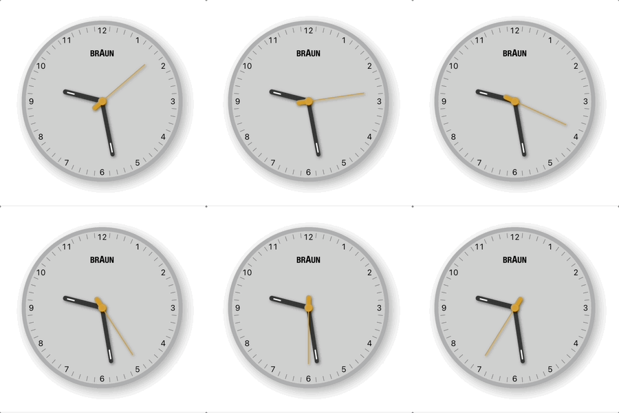
SwiftClockKit provides elegant, customizable clock views for SwiftUI projects—drawn entirely with code, no images! Each clock face features meticulously designed details with realistic skeuomorphic effects, all achieved purely through SwiftUI.
✨ Features
-
🌟 Beautifully Designed Styles: Each clock style is crafted with attention to detail. All effects—shadows, highlights, and textures—are rendered in real-time using only SwiftUI.
-
🎨 Simple Customization: * Multiple design styles (starting with
.braun) * Works seamlessly with system themes (light/dark) * Toggle visual details like reflections -
⏱️ Flexible Time Display: Show the current system time or initialize with any specific time (great for different timezones or events)
-
📱 Cross-Platform: Works on iOS, macOS, and watchOS
-
💻 Pure SwiftUI: No images or external dependencies—just clean SwiftUI code
                                                import SwiftUI

import SwiftClockKit
struct ContentView: View {

var body: some View {

ClockView() // That’s it! Live system time with the default .braun style

.frame(width: 250, height: 250)

}

}
To see SwiftClockKit in action and experiment with its features, you can run the included demo application. The demo showcases the ClockView and allows you to interactively change its appearance and time settings.
Steps to run the demo:
- In your local copy of the repository, navigate to the folder
SwiftClockKitDemo. It contains the demo application. - Inside this folder, locate and open the Xcode project file (e.g.,
SwiftClockKitDemo.xcodeproj) in Xcode. - Click the “Run” button (or press Command+R).
Add SwiftClockKit to your project in Xcode:
- Select File > Add Packages…
- Enter the repository URL:
https://github.com/ibvildthings/SwiftClockKit.git - Choose the latest version and click Add Package
Or add it to your Package.swift:
                                                dependencies: [

.package(url: “https://github.com/ibvildthings/SwiftClockKit.git”, from: “1.0.0”)

]
The simplest implementation shows the current time and automatically adapts to light/dark mode:
                                                ClockView() // Defaults to .braun style, .system appearance, with reflections

.frame(width: 250, height: 250)
Explicitly set the appearance for your clock:
                                                HStack(spacing: 20) {

ClockView(appearance: .light)

.frame(width: 150, height: 150)
ClockView(appearance: .dark)

.frame(width: 150, height: 150)

.background(Color.black.opacity(0.8))

.cornerRadius(10)

}
Display the time for a specific location:
                                                struct LondonClockView: View {

@State private var londonTime: Date = {

// Get current time in London

var calendar = Calendar.current

calendar.timeZone = TimeZone(identifier: “Europe/London”) ?? .current

let londonComponents = calendar.dateComponents(

[.year, .month, .day, .hour, .minute, .second],

from: Date()

)

return Calendar.current.date(from: londonComponents) ?? Date()

}()
var body: some View {

VStack {

Text(“London Time”).font(.headline)
ClockView(date: $londonTime)

.frame(width: 200, height: 200)

}

}

}
⚙️ Customization Options
ClockView can be customized with these parameters:
                                                ClockView(

style: ClockStyle = .braun,   // Visual style of the clock

date: Binding<Date>? = nil,       // Optional starting time (defaults to current system time)

appearance: AppearanceScheme = .system,  // Light, dark, or system-based

showReflections: Bool = true      // Toggle reflection effects

)
Currently available styles:
-
.braun– Clean, elegant design inspired by classic Braun aesthetic -
.vone– Modern, minimalist design by vone
More styles coming in future updates!
.light– Forces light theme.dark– Forces dark theme.system– Adapts to system appearance (default)
📋 Requirements
- iOS 15.0+
- macOS 11.0+
- watchOS 7.0+
- Swift 5.7+ (Swift 5.9+ recommended)
- Xcode 14.0+ (Xcode 15+ recommended)
GitHub
- July 11, 2025
- SwiftUI
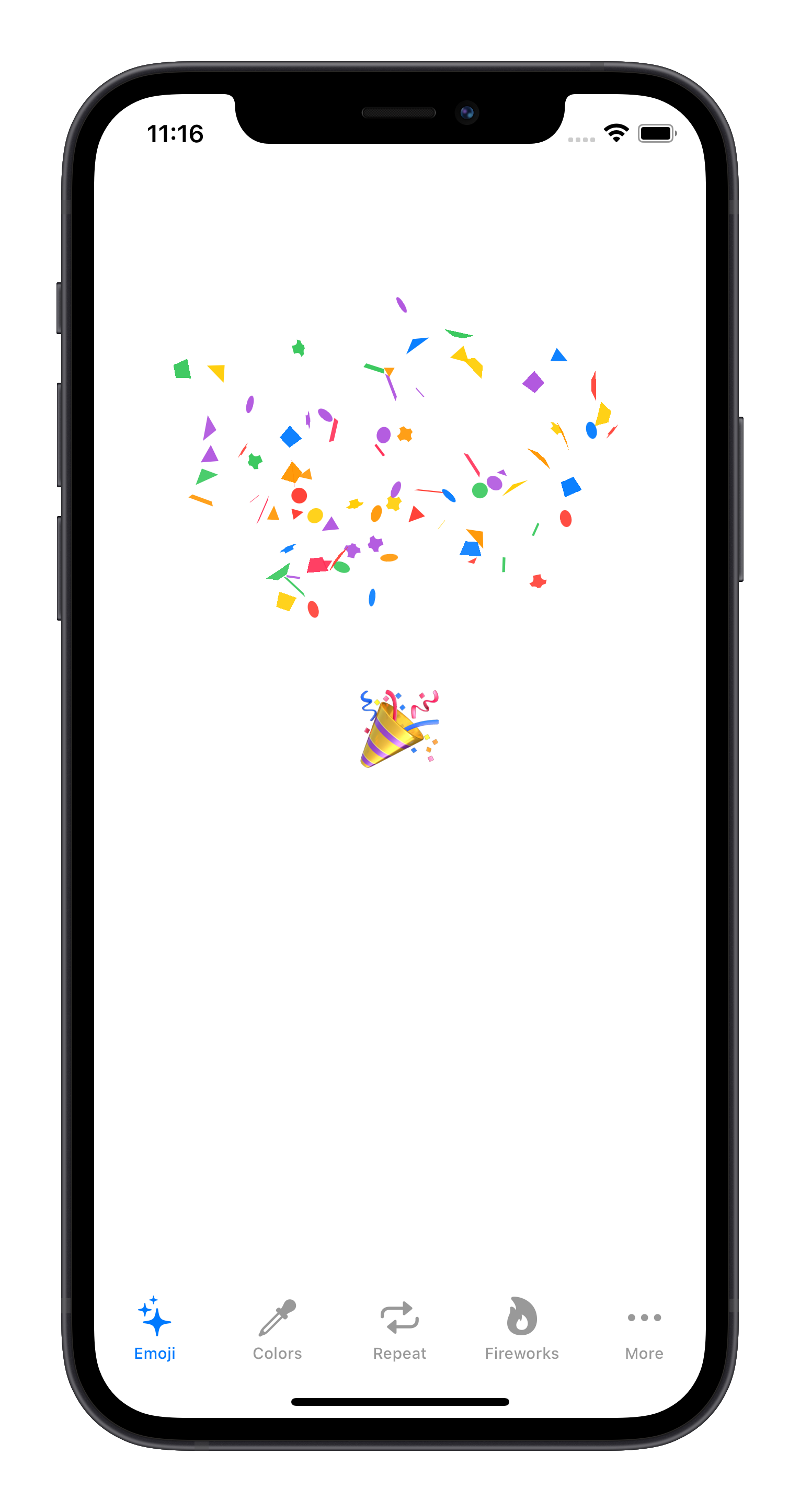
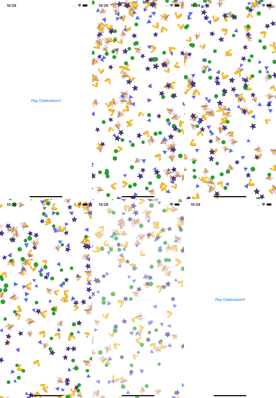
A SwiftUI View that emits confetti with user-defined shapes, images, and text.
- July 11, 2025
- SwiftUI
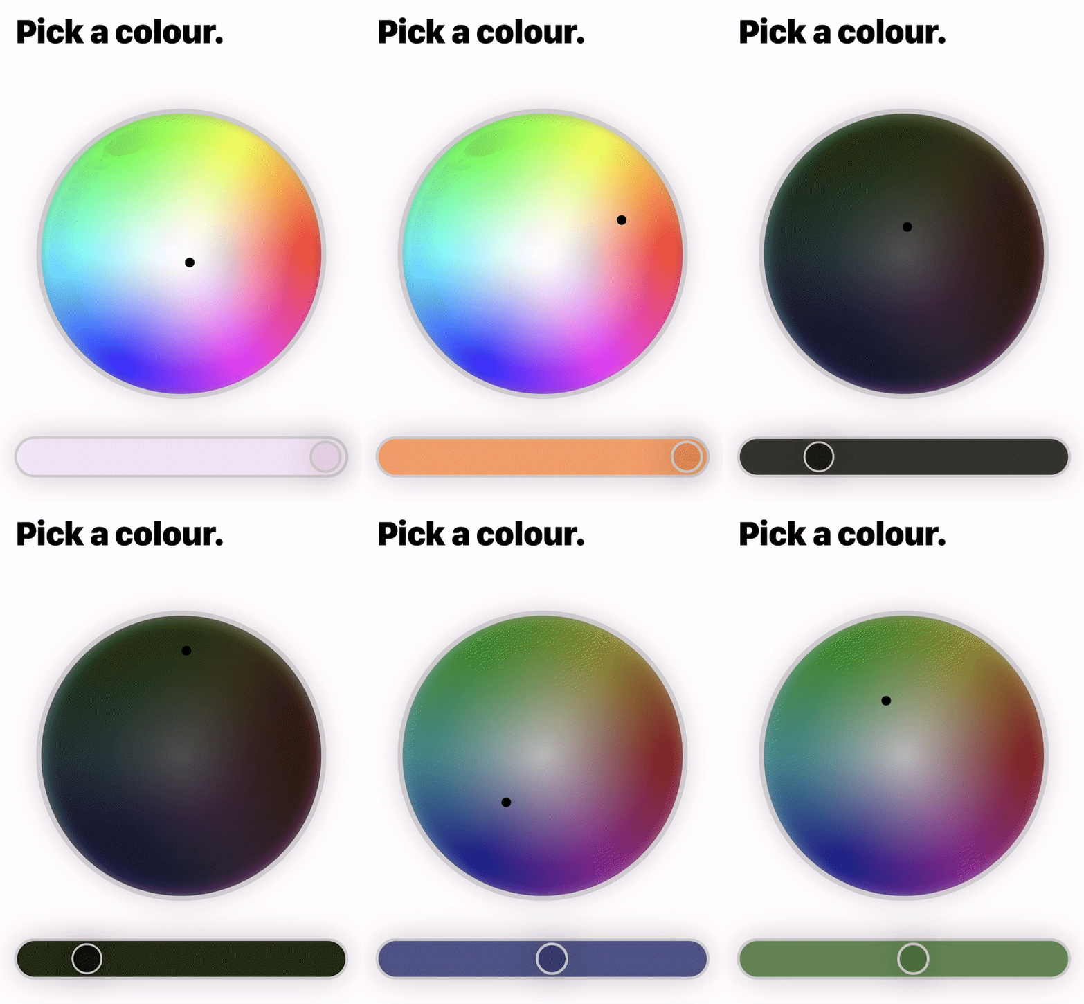
A colour wheel made all in SwiftUI. There are 2 different colour wheels to choose from. The first main one ...
- July 11, 2025
- SwiftUI
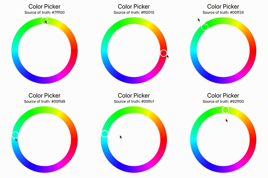
A color picker implementation with color wheel appearance written in plain SwiftUI. It is compatible with UIColor and NSColor.
- July 11, 2025
- SwiftUI
This repository is no longer maintained. Here's why: with the release of iOS 16 SwiftUI now enables most of the ...

