- August 28, 2025
- Mins Read
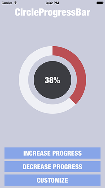
Circle Progress Bar iOS Control.
Require iOS 7.0+ or tvOS 9.0+
Installation
You can install this control in two ways:
- Using CocoaPods:
pod ‘CircleProgressBar’, ‘~> 0.32’
- Manually:
Download source from this repository and copy CircleProgressBarDemo/CircleProgressBar folder to your project.
Don’t forget to add UIKit and QuartzCore frameworks to your project.
How to use
NOTE: If you installed this control manually – please be sure that you’ve added UIKit and QuartzCore frameworks to your project.
NOTE: If you’re using rectangular view for CircleProgressBar control instead of square, ProgressBar will fit available area and will be drawn in center of it.
NOTE: If you’re using swift, be sure to add import CircleProgressBar to source file where you’re using it.
You can simply add UIView in Interface Builder to your controller and change it’s class to “CircleProgressBar” (overridden initWithCoder method will be called) or create CircleProgressBar programmatically using init or initWithFrame methods.
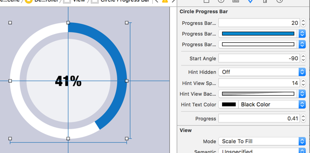
Using Interface Builder you’ll take advantage of Xcode 6 new live rendering feature to customize control according to your needs on the fly (will be explained below in “Customization” section).
To change progress, simply call “setProgress:animated:” method of CircleProgressBar instance:
Objective-c:
[_circleProgressBar setProgress:(CGFloat)progress animated:(BOOL)animated];
Swift:
circleProgressBar.setProgress(CGFloat, animated: Bool)
or “setProgress:animated:duration:” method to define custom animation time:
Objective-c:
[_circleProgressBar setProgress:(CGFloat)progress animated:(BOOL)animated duration:(CGFloat)duration];
Swift:
circleProgressBar.setProgress(CGFloat, animated: Bool, duration: CGFloat)
To check if there is ongoing animation use isAnimating property. To stop an ongoing animation, you can use stopAnimation method. In this case it will set the progress to animation end value:
Objective-c:
[_circleProgressBar stopAnimation];
Swift:
circleProgressBar.stopAnimation()
Customization
CircleProgressBar provides many customization properties:
                                                // Progress Bar Customization

@property (nonatomic) CGFloat progressBarWidth;

@property (nonatomic) UIColor *progressBarProgressColor;

@property (nonatomic) UIColor *progressBarTrackColor;

@property (nonatomic) CGFloat startAngle;
// Hint View Customization (inside progress bar)

@property (nonatomic) BOOL hintHidden;

@property (nonatomic) CGFloat hintViewSpacing;

@property (nonatomic) UIColor *hintViewBackgroundColor;

@property (nonatomic) UIFont *hintTextFont;

@property (nonatomic) UIColor *hintTextColor;
Using these customization properties you can define Progress Bar’s width, color of filled part, color of empty part, Progress Bar’s start angle, Hint View’s spacing (between progress bar and hint view), background color, hint text color and hint text font.
If you want to hide HintView you can simply set hintHidden property to NO.
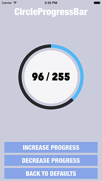
To customize text inside HintView you can simply set TextGenerationBlock:
Objective-c:
[_circleProgressBar setHintTextGenerationBlock:(StringGenerationBlock)generationBlock];
Swift:
circleProgressBar.setHintTextGenerationBlock(generationBlock: StringGenerationBlock!)
For example this way:
Objective-c:
                                                [_circleProgressBar setHintTextGenerationBlock:^NSString *(CGFloat progress) {

return [NSString stringWithFormat:@”%.0f / 255″, progress * 255];

}];
Swift:
                                                circleProgressBar.setHintTextGenerationBlock { (progress) -> String? in

return String.init(format: “%.0f / 255”, arguments: [progress * 255])

}
If you want to use NSAttributedString you can set instead HintAttributedGenerationBlock:
Objective-c:
[_circleProgressBar setHintAttributedGenerationBlock:(AttributedStringGenerationBlock)generationBlock];
Swift:
circleProgressBar.setHintAttributedGenerationBlock(generationBlock: AttributedStringGenerationBlock!)
If you using Interface Builder, you can take an advantage of Xcode 6 live render with IBDesignable and IBInspectable features to customize control:
GitHub
#iosanimation #progressindicator
YOU MIGHT ALSO LIKE...

- August 27, 2025
- SwiftUI
This package provides you with an easy way to show tooltips over any SwiftUI view, since Apple does not provide ...
- August 27, 2025
- SwiftUI
- Uncategorized
SimpleToast is a simple, lightweight, flexible and easy to use library to show toasts / popup notifications inside iOS or ...
- August 27, 2025
- SwiftUI
Create Toast Views with Minimal Effort in SwiftUI Using SSToastMessage. SSToastMessage enables you to effortlessly add toast notifications, alerts, and ...

- August 27, 2025
- Mins Read
- August 27, 2025
- Mins Read
- August 27, 2025
- Mins Read
- August 22, 2025
- Mins Read
