- August 28, 2025
- Mins Read
- July 11, 2025

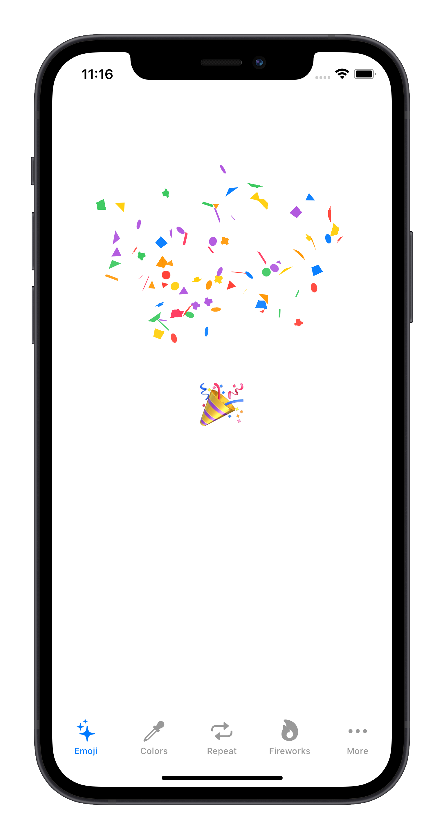
Customize confetti animations.
- All elements are built with pure SwiftUI.
- Select from default confetti shapes, emojis, SF Symbols or text.
- Trigger the animation with one state change multiple times with a haptic feed back on each explosion.
🌄 Examples
💻 Installation
Swift Package Manager
The Swift Package Manager is a tool for managing the distribution of Swift code. It’s integrated with the Swift build system to automate the process of downloading, compiling, and linking dependencies.
To integrate ConfettiSwiftUI into your Xcode project using Xcode 12, specify it in File > Swift Packages > Add Package Dependency...:
https://github.com/simibac/ConfettiSwiftUI.git, :branch=”master”
Manually
If you prefer not to use any of dependency managers, you can integrate ConfettiSwiftUI into your project manually. Put Sources/ConfettiSwiftUI folder in your Xcode project. Make sure to enable Copy items if needed and Create groups.
🧳 Requirements
- iOS 14.0+ | macOS 11+
- Swift 5+
🛠 Usage
First, add import ConfettiSwiftUI on every swift file you would like to use ConfettiSwiftUI. Define a integer as a state varable which is responsible for triggering the animation. Any change to that variable will span a new animation (increment and decrement).
                                                import ConfettiSwiftUI

import SwiftUI
struct ContentView: View {
@State private var trigger: Int = 0
var body: some View {

Button(“🎉”) {

trigger += 1

}

.confettiCannon(trigger: $trigger)

}

}
Parameters
| parameter | type | description | default |
|---|---|---|---|
| trigger | Binding | on any change of this variable triggers the animation | 0 |
| num | Int | amount of confettis | 20 |
| confettis | [ConfettiType] | list of shapes and text | [.shape(.circle), .shape(.triangle), .shape(.square), .shape(.slimRectangle), .shape(.roundedCross)] |
| colors | [Color] | list of colors applied to the default shapes | [.blue, .red, .green, .yellow, .pink, .purple, .orange] |
| confettiSize | CGFloat | size that confettis and emojis are scaled to | 10.0 |
| rainHeight | CGFloat | vertical distance that confettis pass | 600.0 |
| fadesOut | Bool | size that confettis and emojis are scaled to | true |
| opacity | Double | maximum opacity during the animation | 1.0 |
| openingAngle | Angle | boundary that defines the opening angle in degrees | Angle.degrees(60) |
| closingAngle | Angle | boundary that defines the closing angle in degrees | Angle.degrees(120) |
| radius | CGFloat | explosion radius | 300.0 |
| repetitions | Int | number of repetitions for the explosion | 1 |
| repetitionInterval | Double | duration between the repetitions | 1.0 |
| hapticFeedback | Bool | haptic feedback on each confetti explosion | true |
Configurator Application With Live Preview
You can use the configurator app in demo project here to configure your desired animation or get inspired by one of the many examples.
Configuration Examples
Color and Size
.confettiCannon(trigger: $trigger, colors: [.red, .black], confettiSize: 20)
Repeat
.confettiCannon(trigger: $trigger, repetitions: 3, repetitionInterval: 0.7)
Firework
.confettiCannon(trigger: $trigger, num: 50, openingAngle: Angle(degrees: 0), closingAngle: Angle(degrees: 360), radius: 200)
Emoji
.confettiCannon(trigger: $trigger, confettis: [.text(“❤️”), .text(“💙”), .text(“💚”), .text(“🧡”)])
Endless
.confettiCannon(trigger: $trigger, num:1, confettis: [.text(“💩”)], confettiSize: 20, repetitions: 100, repetitionInterval: 0.1)
Make-it-Rain
.confettiCannon(trigger: $trigger, num:1, confettis: [.text(“💵”), .text(“💶”), .text(“💷”), .text(“💴”)], confettiSize: 30, repetitions: 50, repetitionInterval: 0.1)
.confettiCannon(trigger: $trigger8, confettis: [.image(“arb”), .image(“eth”), .image(“btc”), .image(“op”), .image(“link”), .image(“doge”)], confettiSize: 20)
GitHub
- August 27, 2025
- SwiftUI
This package provides you with an easy way to show tooltips over any SwiftUI view, since Apple does not provide ...
- August 27, 2025
- SwiftUI
- Uncategorized
SimpleToast is a simple, lightweight, flexible and easy to use library to show toasts / popup notifications inside iOS or ...
- August 27, 2025
- SwiftUI
Create Toast Views with Minimal Effort in SwiftUI Using SSToastMessage. SSToastMessage enables you to effortlessly add toast notifications, alerts, and ...


