- August 28, 2025
- Mins Read
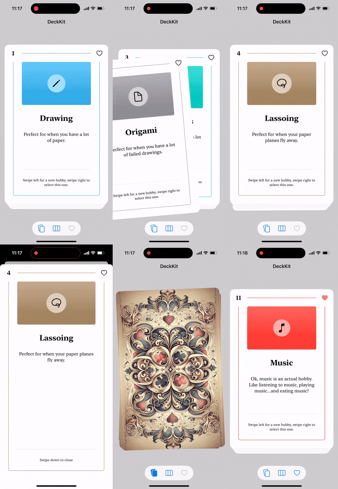
DeckKit is a SwiftUI library that makes it easy to create deck-based apps. It has a DeckView that can render any list of items, with support for swipe gestures, edge swipes, shuffling, etc.
DeckKit can be customized to great extent. You can change colors, fonts, etc. and use completely custom views. It also has tools to manage favorites.
Installation
DeckKit can be installed with the Swift Package Manager:
https://github.com/danielsaidi/DeckKit.git
Support My Work
Maintaining my various open-source tools takes significant time and effort. You can become a sponsor to help me dedicate more time to creating, maintaining, and improving these projects. Every contribution, no matter the size, makes a real difference in keeping these tools free and actively developed. Thank you for considering!
Getting started
With DeckKit, you can create a deck of cards with any type that conforms to Identifiable:
                                                struct Hobby: Identifiable {
var name: String

var text: String
var id: String { name }

}
struct MyView: View {
@State

var hobbies: [Hobby] = …
var body: some View {

DeckView($hobbies) { hobby in

RoundedRectangle(cornerRadius: 25.0)

.fill(.blue)

.overlay(Text(hobby.name))

.shadow(radius: 10)

}

}

}
DeckKit has several view components for presenting decks, e.g. DeckView and DeckPageView.
See the online getting started guide for more information.
GitHub
- August 27, 2025
- SwiftUI
This package provides you with an easy way to show tooltips over any SwiftUI view, since Apple does not provide ...
- August 27, 2025
- SwiftUI
- Uncategorized
SimpleToast is a simple, lightweight, flexible and easy to use library to show toasts / popup notifications inside iOS or ...
- August 27, 2025
- SwiftUI
Create Toast Views with Minimal Effort in SwiftUI Using SSToastMessage. SSToastMessage enables you to effortlessly add toast notifications, alerts, and ...


