- August 28, 2025
- Mins Read
Usage
To run the example project, clone the repo, and run pod install from the Example directory first.
There’s also an Swift implementation developed by lojals.
Installtion
EMEmojiableBtn is available through CocoaPods. To install it, simply add the following line to your Podfile:
pod “EMEmojiableBtn”
Examples
-
Basic Instance
Example Code
                                                EMEmojiableBtn *button = [[EMEmojiableBtn alloc] initWithFrame:CGRectMake(20, 150, 52.0, 52.0)];

button.delegate = self;

button.dataset = @[

[[EMEmojiableOption alloc] initWithImage:@”img_1″ withName:@”dislike”],

[[EMEmojiableOption alloc] initWithImage:@”img_2″ withName:@”broken”],

[[EMEmojiableOption alloc] initWithImage:@”img_3″ withName:@”he he”],

[[EMEmojiableOption alloc] initWithImage:@”img_4″ withName:@”ooh”],

[[EMEmojiableOption alloc] initWithImage:@”img_5″ withName:@”meh !”],

[[EMEmojiableOption alloc] initWithImage:@”img_6″ withName:@”ahh !”]

];

[button setImage:[UIImage imageNamed:@”img_1″] forState:UIControlStateNormal];

[self.view addSubview:button];

2. Custom styled instance
Example Code
With this instance you can fully custom your component. Following the EMEmojiableBtnConfig variables.
You can custom your selector with the following variables, used in the
EMEmojiableBtnConfig *config = [[EMEmojiableBtnConfig alloc] init];
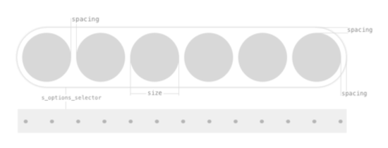
config.spacing = 6.0;
config.size = 30.0;
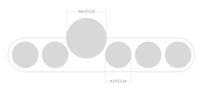
config.minSize = 34.0;
config.maxSize = 45.0;
config.s_options_selector = 30.0;
EMEmojiableBtn *button = [[EMEmojiableBtn alloc] initWithFrame:CGRectMake(20, 150, 52.0, 52.0) withConfig:config];
button.delegate = self;
button.dataset = @[
[[EMEmojiableOption alloc] initWithImage:@”img_1″ withName:@”dislike”],
[[EMEmojiableOption alloc] initWithImage:@”img_2″ withName:@”broken”],
[[EMEmojiableOption alloc] initWithImage:@”img_3″ withName:@”he he”],
[[EMEmojiableOption alloc] initWithImage:@”img_4″ withName:@”ooh”],
[[EMEmojiableOption alloc] initWithImage:@”img_5″ withName:@”meh !”],
[[EMEmojiableOption alloc] initWithImage:@”img_6″ withName:@”ahh !”]
];
[button setImage:[UIImage imageNamed:@”img_1″] forState:UIControlStateNormal];
[self.view addSubview:button];
Available customization options using EMEmojiableBtnConfig
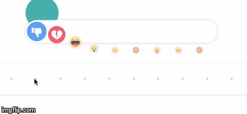
size– Size of each available optionmaxSize– Size of option when it is hilightedminSize– Size of options when one option is hilighted. When option is hilighted other options are smallerspacing– Spacing between optionss_options_selector– Bottom space of option selector view to button and information viewbackgroundColor– Background color of screen when options selector is active after UILongPressGestureRecognizeroptionsViewInitialAlpha– Initial opacity of options listing viewoptionsViewBackgroundColor– Background color of options listing viewoptionsViewShadowColor– Shadow color of options listing viewoptionsViewShadowOpacity– Opacity of options listing shadowoptionsViewShadowOffset– Offset of options listing shadowinformationViewBackgroundColor– Background color of information viewinformationViewDotsColor– Dots color of information viewinformationViewBorderColor– Border color of information viewinformationViewFont– Font of information viewinformationViewTextColor– Text color of information viewinformationViewText– Text for information view. Default : Release to cancel
GitHub
#cocoapods #objectivec #reactions #swift #uibutton
YOU MIGHT ALSO LIKE...

- August 27, 2025
- SwiftUI
This package provides you with an easy way to show tooltips over any SwiftUI view, since Apple does not provide ...
- August 27, 2025
- SwiftUI
- Uncategorized
SimpleToast is a simple, lightweight, flexible and easy to use library to show toasts / popup notifications inside iOS or ...
- August 27, 2025
- SwiftUI
Create Toast Views with Minimal Effort in SwiftUI Using SSToastMessage. SSToastMessage enables you to effortlessly add toast notifications, alerts, and ...

- August 27, 2025
- Mins Read
- August 27, 2025
- Mins Read
- August 27, 2025
- Mins Read
- August 22, 2025
- Mins Read
