- August 28, 2025
- Mins Read
- July 2, 2025

FloatingButton
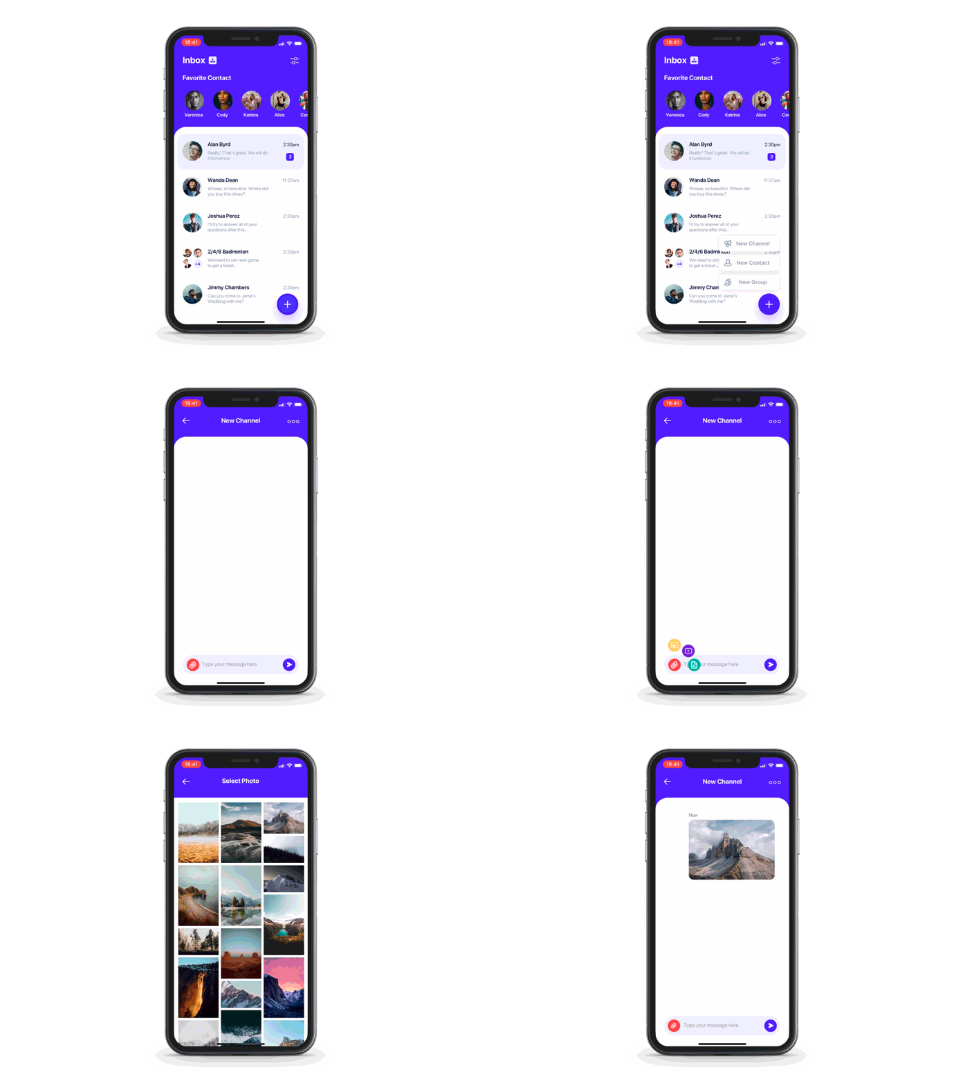
Easily customizable floating button menu created with SwiftUI
Usage
-
Create main button view and a number of submenu buttons — both should be cast to
AnyViewtype. -
Pass both to
FloatingButtonconstructor:
FloatingButton(mainButtonView: mainButton, buttons: buttons)
-
You may also pass a binding which will determine if the menu is currently open. You may use this to close the menu on any submenu button tap for example.
FloatingButton(mainButtonView: mainButton, buttons: buttons, isOpen: $isOpen)
- Chain
.straight()or.circle()to specify desired menu type. - Chain whatever you like afterwards. For example
                                                FloatingButton(mainButtonView: mainButton, buttons: textButtons)

.straight()

.direction(.top)

.alignment(.left)

.spacing(10)

.initialOffset(x: -1000)

.animation(.spring())
FloatingButton(mainButtonView: mainButton2, buttons: buttonsImage.dropLast())

.circle()

.startAngle(3/2 * .pi)

.endAngle(2 * .pi)

.radius(70)

.layoutDirection(.counterClockwise)
Universal options
spacing – space between submenu buttons
initialScaling – size multiplyer for submenu buttons when the menu is closed
initialOffset – offset for submenu buttons when the menu is closed
initialOpacity – opacity for submenu buttons when the menu is closed
animation – custom SwiftUI animation like Animation.easeInOut() or Animation.spring()
delays – delay for each submenu button’s animation start – you can pass array of delays – one for each element – or you can pass delayDelta – then this same delay will be used for each element mainZStackAlignment – main button and submenu buttons are contained in one ZStack (not an overlay so the menu has a correct size), you can change this ZStack’s alignment with this parameter inverseZIndex – inverse zIndex of mainButton and the children. Use, for example, if you have a negative spacing and want to change the order wholeMenuSize – pass CGSize binding to get updates of menu’s size. Menu’s size includes main button frame and all of elements’ frames menuButtonsSize – pass CGSize binding to get updates of combined menu elements’ size
Straight menu only options
direction – position of submenu buttons relative to main menu button
alignment – alignment of submenu buttons relative to main menu button
Circle only options
startAngle
endAngle
radius – distance between center of main button and centers of submenu buttons
layoutDirection – changes the button layout direction from the startAngle to the endAngle
Examples
To try the FloatingButton examples:
- Clone the repo
https://github.com/exyte/FloatingButton.git - Open
FloatingButtonExample.xcodeprojin the Xcode - Try it!
Installation
Swift Package Manager
                                                dependencies: [

.package(url: “https://github.com/exyte/FloatingButton.git”)

]
Requirements
- iOS 14.0+ / macOS 11.0+ / watchOS 7.0+
- Xcode 12+
GitHub
- August 27, 2025
- SwiftUI
This package provides you with an easy way to show tooltips over any SwiftUI view, since Apple does not provide ...
- August 27, 2025
- SwiftUI
- Uncategorized
SimpleToast is a simple, lightweight, flexible and easy to use library to show toasts / popup notifications inside iOS or ...
- August 27, 2025
- SwiftUI
Create Toast Views with Minimal Effort in SwiftUI Using SSToastMessage. SSToastMessage enables you to effortlessly add toast notifications, alerts, and ...


