- August 28, 2025
- Mins Read
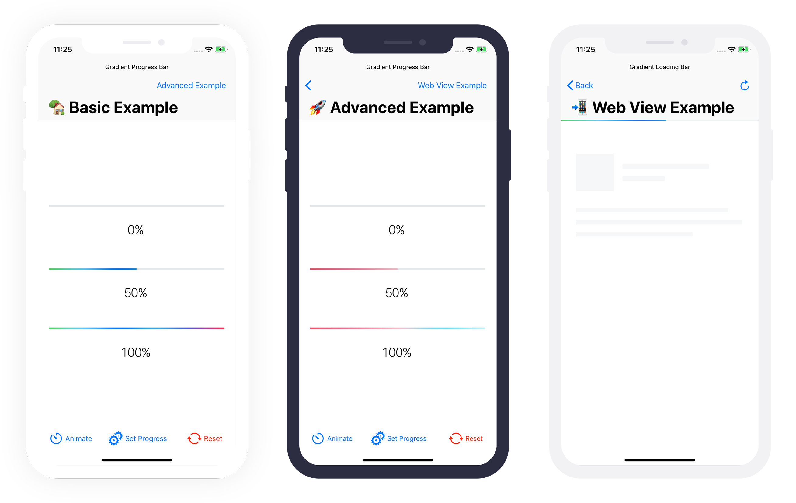
A customizable gradient progress bar (UIProgressView). Inspired by iOS 7 Progress Bar from Codepen.
Example
To run the example project, clone the repo, and open the workspace from the Example directory.
Requirements
- Swift 5.5
- Xcode 13
- iOS 13.0+
Note: In case you need support for iOS versions lower than 13, you can fallback to version 2.X.X.
Integration
CocoaPods
CocoaPods is a dependency manager for Cocoa projects. For usage and installation instructions, visit their website. To integrate GradientProgressBar into your Xcode project using CocoaPods, specify it in your Podfile:
pod ‘GradientProgressBar’, ‘~> 3.0’
Carthage
Carthage is a decentralized dependency manager that builds your dependencies and provides you with binary frameworks. To integrate GradientProgressBar into your Xcode project using Carthage, specify it in your Cartfile:
github “fxm90/GradientProgressBar” ~> 3.0
Run carthage update to build the framework and drag the built GradientProgressBar.framework into your Xcode project.
Swift Package Manager
The Swift Package Manager is a tool for automating the distribution of Swift code and is integrated into the swift compiler. It is in early development, but Gradient Progress Bar does support its use on supported platforms.
Once you have your Swift package set up, adding Gradient Progress Bar as a dependency is as easy as adding it to the dependencies value of your Package.swift.
                                                dependencies: [

.package(url: “https://github.com/fxm90/GradientProgressBar”, from: “3.0.0”)

]
How to use (UIKit).
Scroll down for the SwiftUI documentation.
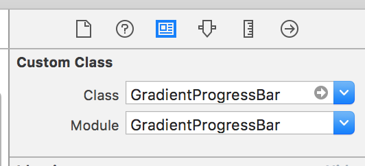
Simply drop a UIView into your View Controller in the Storyboard. Select your view and in the Identity Inspector change the class to GradientProgressBar.
Don’t forget to change the module to GradientProgressBar too.

Setup the constraints for the UIView according to your needs.
Import GradientProgressBar in your view controller source file.
import GradientProgressBar
Create an IBOutlet of the progress view in your view controller source file.
@IBOutlet weak var gradientProgressView: GradientProgressBar!
After that you can set the progress programmatically as you would do on a normal UIProgressView.
gradientProgressView.setProgress(0.75, animated: true)
gradientProgressView.progress = 0.75
Configuration
-property animationDuration
Adjusts the animation duration for calls to setProgress(_:animated:):
                                                progressView.animationDuration = 2.0

progressView.setProgress(progress, animated: true)
-Property gradientColors
Adjusts the colors, used for the gradient inside the progress-view.
                                                progressView.gradientColors: [UIColor] = [

.red,

.white,

.blue

]
-Property timingFunction
Adjusts the timing function for calls to setProgress(_:animated:), with animated set to true.
progressView.timingFunction = CAMediaTimingFunction(name: .easeInEaseOut)
Troubleshooting
Interface Builder Support
Unfortunately the Interface Builder support is currently broken for Cocoapods frameworks. If you need Interface Builder support, add the following code to your Podfile and run pod install again. Afterwards you should be able to use the GradientProgressBar inside the Interface Builder 🙂
                                                post_install do |installer|

installer.pods_project.build_configurations.each do |config|

next unless config.name == ‘Debug’
config.build_settings[‘LD_RUNPATH_SEARCH_PATHS’] = [

‘$(FRAMEWORK_SEARCH_PATHS)’

]

end

end
Source: Cocoapods – Issue 7606
Show progress of WKWebView
Based on my gist, the example application also contains the sample code, for attaching the progress view to a UINavigationBar. Using “Key-Value Observing” we change the progress of the bar accordingly to the property estimatedProgress of the WKWebView.
Please have a look at the example application for further details 🙂
How to use (SwiftUI)
Scroll up for the UIKit documentation.
Since version 2.1.0 this framework provides a ProgressViewStyle that can be used in SwiftUI.
                                                struct ExampleView: View {
@State

private var progress = 0.5
var body: some View {

ProgressView(value: progress, total: 1)

.progressViewStyle(.gradientProgressBar)

.frame(height: 4)

}

}
Configuration
                                                struct ExampleView: View {
@State

private var progress = 0.5
var body: some View {

ProgressView(value: progress, total: 1)

.progressViewStyle(

.gradientProgressBar(

backgroundColor: .gray.opacity(0.05),

gradientColors: [.red, .white, .blue],

cornerRadius: 4)

)

.frame(height: 8)

}

}
-Parameter backgroundColor
The background-color shown behind the gradient (clipped by a possible cornerRadius).
-Parameter gradientColors
The colors used for the gradient.
-Parameter cornerRadius
The corner-radius used on the background and the progress bar.
Add / Adapt animation
To add an animation you have to wrap the update of the @State property inside withAnimation(_:_:).
                                                Button(“Animate progress”) {

withAnimation(.easeInOut) {

progress += 0.1

}

}
Please have a look at the Apple documentation for Animation on how to further customise the animation.
GitHub
- August 27, 2025
- SwiftUI
This package provides you with an easy way to show tooltips over any SwiftUI view, since Apple does not provide ...
- August 27, 2025
- SwiftUI
- Uncategorized
SimpleToast is a simple, lightweight, flexible and easy to use library to show toasts / popup notifications inside iOS or ...
- August 27, 2025
- SwiftUI
Create Toast Views with Minimal Effort in SwiftUI Using SSToastMessage. SSToastMessage enables you to effortlessly add toast notifications, alerts, and ...


