- August 28, 2025
- Mins Read
A fully customisable subclass of the native UIControl which allows you to create beautiful buttons without writing any line of code.
Preview
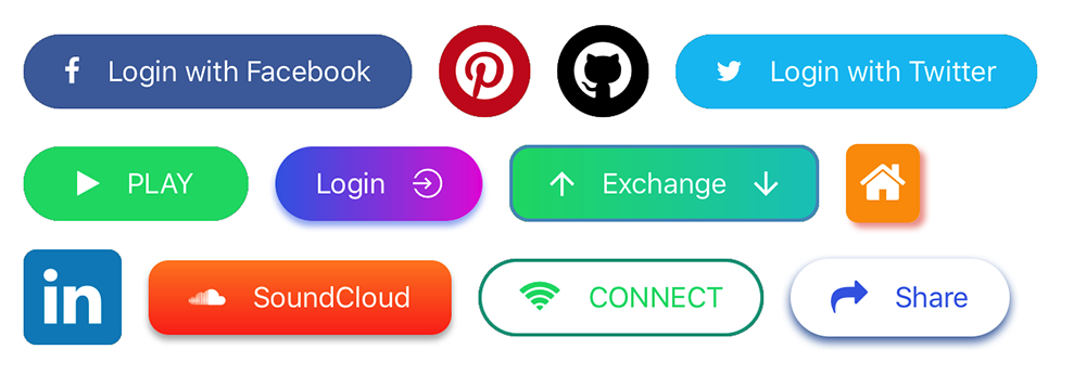
You’ll be able to create buttons like these by using only the interface builder:
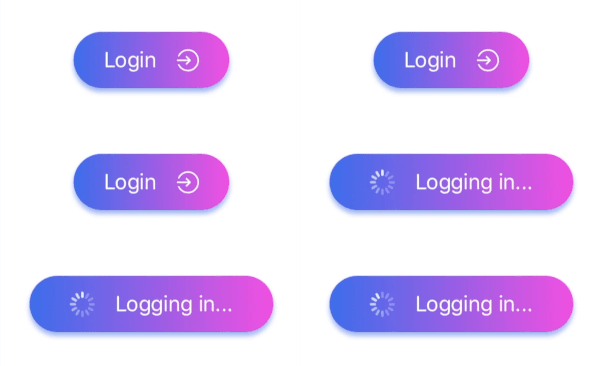
Moreover you can use them for asynchronous operations.
Install
To integrate LGButton into your Xcode project using CocoaPods, specify it in your Podfile:
                                                use_frameworks!
pod ‘LGButton’
Icons and images
You can add images/icons to your button, icons are taken from different ready to use font icons collections, images can be imported directly from your project assets folder.
You can customise icons/images on the left and/or on the right of the button title.
Icons
Icons are managed by SwiftIconFont integration, so you can easily add and customise button icons by choosing from the most popular font icons collections. In particular:
| Collection | Font name | Cheat Sheet |
|---|---|---|
| Font Awesome | fa | List |
| Ion Icons | io | List |
| Octicons | oc | List |
| Open Iconic | ic | List |
| Material Icon | ma | List |
| Themify | ti | List |
| Map Icons | mi | List |
The main properties that you need to set in order to use font icons are:
-
Icon Font Name: you can pick one value from the table above, different values will be ignored (please consider that not all the icons may be available since this library may not be updated right after a font library update).
-
Icon String: the icon name taken from the cheatsheet without the collection prefix.
So, if you want to use fa-align-left from Font Awesome, Icon Font Name will be fa and Icon String will be align-left.
Images
Set the Image source property in order to use an image from your assets folder.
Note: if Image source is set, every other property about the font icon on the same side will be ignored.
Usage
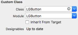
Drag and drop an UIView object into your view controller and set its class and module to LGButton.
Customise your button by setting the properties from the Interface Builder.
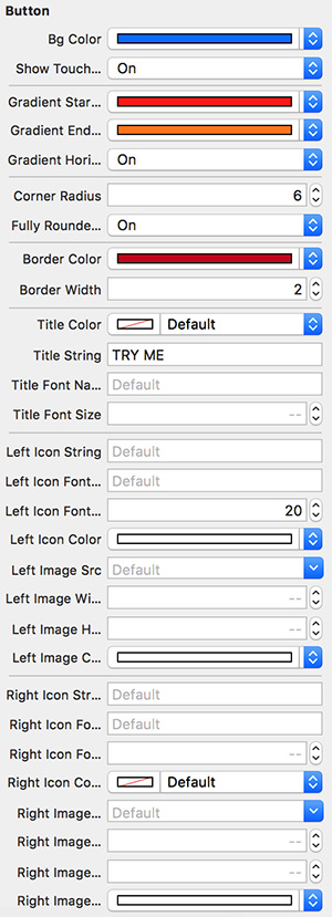
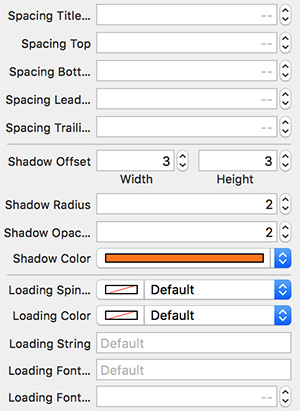
Supported Attributes
| Attribute | Description | Default value |
|---|---|---|
| Bg Color | Main background color | clear |
| Show Touch Feedback | Whether a touch feedback should be visible or not | true |
| Gradient Start Color | The first color of the gradient background | nil |
| Gradient End Color | The second color of the gradient background | nil |
| Gradient End Color | The second color of the gradient background | nil |
| Gradient Horizontal | Whether the gradient should be horizontal or not | false |
| Gradient Rotation | Set the gradient rotation angle (degrees from -360 to 360) | 0 |
| Corner Radius | The corner radius | 0.0 |
| Fully Rounded Corners | Apply a corner radius equals to height/2 | false |
| Border Color | The border color | white |
| Border Width | The border width | 0.0 |
| Title Color | The title color | white |
| Title String | The title string | EMPTY_STRING |
| Title Font Name | The title font name | nil |
| Title Font Size | The title font size | 14.0 |
| Vertical orientation | If true the left icon will be placed on the top and the right icon will be placed on the bottom |
false |
| Left Icon String | The name of the left icon (taken from the cheat sheet) | EMPTY_STRING |
| Left Icon Font Name | The name of the left icon font name (taken from the table above) | EMPTY_STRING |
| Left Icon Font Size | The left icon font size | 14.0 |
| Left Icon Color | The left icon color | white |
| Left Image Src | The name of the left source asset | nil |
| Left Image Height | The left image height | 20.0 |
| Left Image Width | The left image width | 20.0 |
| Left Image Color | The left image tint color | nil |
| Right Icon String | The name of the right icon (taken from the cheat sheet) | EMPTY_STRING |
| Right Icon Font Name | The name of the right icon font name (taken from the table above) | EMPTY_STRING |
| Right Icon Font Size | The right icon font size | 14.0 |
| Right Icon Color | The right icon color | white |
| Right Image Src | The name of the right source asset | nil |
| Right Image Height | The right image height | 20.0 |
| Right Image Width | The right image width | 20.0 |
| Right Image Color | The right image tint color | nil |
| Spacing Title Icon | The spacing between the title and the image/icon | 16.0 |
| Spacing Top | The internal top spacing | 8.0 |
| Spacing Bottom | The internal bottom spacing | 8.0 |
| Spacing Leading | The internal leading spacing | 16.0 |
| Spacing Trailing | The internal trailing spacing | 16.0 |
| Shadow Offset | The shadow offset | (0,0) |
| Shadow Radius | The shadow radius | 0.0 |
| Shadow Opacity | The shadow opacity | 1.0 |
| Shadow Color | The shadow color | black |
| Loading spinner Color | The loading spinner color | white |
| Loading String | The loading message text | EMPTY_STRING |
| Loading Font Name | The loading message font name | EMPTY_STRING |
| Loading Font Size | The loading message font size | 14.0 |
| Left Aligned | true if the button items should be aligned to the left. It requires the button to have a fixed width |
false |
| Right Aligned | true if the button items should be aligned to the right. It requires the button to have a fixed width |
false |
You can download the demo project if you want to check more.
Issues
Feel free to submit issues and features requests.
GitHub
- August 27, 2025
- SwiftUI
This package provides you with an easy way to show tooltips over any SwiftUI view, since Apple does not provide ...
- August 27, 2025
- SwiftUI
- Uncategorized
SimpleToast is a simple, lightweight, flexible and easy to use library to show toasts / popup notifications inside iOS or ...
- August 27, 2025
- SwiftUI
Create Toast Views with Minimal Effort in SwiftUI Using SSToastMessage. SSToastMessage enables you to effortlessly add toast notifications, alerts, and ...


