
- August 28, 2025
- Mins Read
Light Chart – All type chart like line, curved, curved filled, curved filled line, curved filled dash line
- July 9, 2025

LightChart is a lightweight SwiftUI package with line charts implementation. You can use it when you need only a chart that will perfectly fit into your View. It doesn’t have any interaction, titles, different types of diagram or anything else, just a representation of your data set.
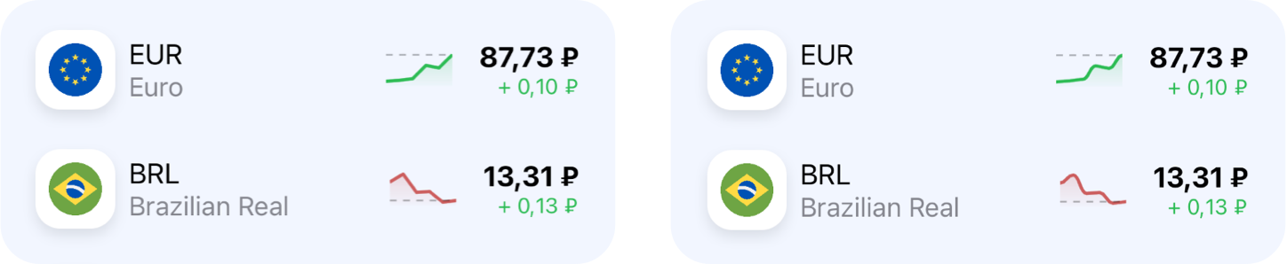
Currently LightChart have only line type of chart with sharp corners or a curved one. That’s how it looks in the real application on currency exchange rates example:
Installation
It’s a Swift Package, so you need to do the following:
- Open
Filein Xcode menu - Open
Swift Packages - Choose
Add Package Dependency...option - In the
Enter package repository URLfield paste this URL:https://github.com/pichukov/LightChart - Choose any existing version or a
masterbranch option
Usage
Add import LightChart Add LightChartView into your SwiftUI code
LightChartView(data: [4, 8, 12, 10, 25])
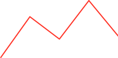
By default it will draw a red line chart:
To customize it you can use several properties:
type
The type of chart, it’s an enum with two cases:
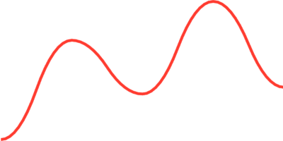
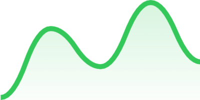
.lineis a default type that will draw a chart presented above.curvedwill draw a curved chart, for example:
LightChartView(data: [2, 17, 9, 23, 10], type: .curved)
visualType
The visual part of the chart. An enum with three cases:
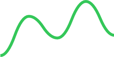
.outline(color: Color, lineWidth: CGFloat)to specify acolorandlineWidthforstroke
                                                LightChartView(data: [2, 17, 9, 23, 10],

type: .curved,

visualType: .outline(color: .green, lineWidth: 5))
.filled(color: Color, lineWidth: CGFloat)use stroke color to fill the chart with a gradient
                                                LightChartView(data: [2, 17, 9, 23, 10],

type: .curved,

visualType: .filled(color: .green, lineWidth: 5))
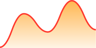
.customFilled(color: Color, lineWidth: CGFloat, fillGradient: LinearGradient)also provides an option to change the fill gradient
                                                LightChartView(data: [2, 17, 9, 23, 10],

type: .curved,

visualType: .customFilled(color: .red,

lineWidth: 3,

fillGradient: LinearGradient(

gradient: .init(colors: [Color.orange.opacity(0.7), Color.orange.opacity(0.1)]),

startPoint: .init(x: 0.5, y: 1),

endPoint: .init(x: 0.5, y: 0)

)))
offset
By default the offset is 0 and it means that the chart takes up the entire area of the parent view. You can move the chart line up with changing the offset value. For example if you will use the offset: 0.2 you chart line will move up and take only 80% of the parent view
                                                LightChartView(data: [2, 17, 9, 23, 10],

type: .curved,

visualType: .filled(color: .green, lineWidth: 3),

offset: 0.2)
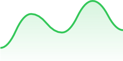
As you can see on picture above the offset effects only the chart line but not the fill gradient
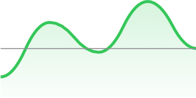
currentValueLineType
There is an option to add a horizontal line that will point the last value of the data set. A currentValueLineType is an enum that has three cases:
.noneis a default value that doesn’t show any line.line(color: Color, lineWidth: CGFloat)adds a line withcolorandlineWidthfor astroke
                                                LightChartView(data: [2, 17, 9, 23, 10],

type: .curved,

visualType: .filled(color: .green, lineWidth: 3),

offset: 0.2,

currentValueLineType: .line(color: .gray, lineWidth: 1))
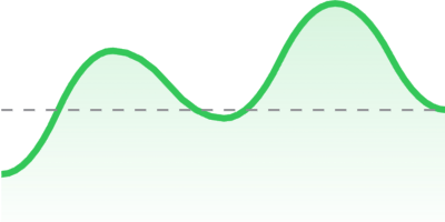
.dash(color: Color, lineWidth: CGFloat, dash: [CGFloat])adds a dashed line
                                                LightChartView(data: [2, 17, 9, 23, 10],

type: .curved,

visualType: .filled(color: .green, lineWidth: 3),

offset: 0.2,

currentValueLineType: .dash(color: .gray, lineWidth: 1, dash: [5]))
GitHub
#chart #graph
YOU MIGHT ALSO LIKE...

- August 27, 2025
- SwiftUI
This package provides you with an easy way to show tooltips over any SwiftUI view, since Apple does not provide ...
- August 27, 2025
- SwiftUI
- Uncategorized
SimpleToast is a simple, lightweight, flexible and easy to use library to show toasts / popup notifications inside iOS or ...
- August 27, 2025
- SwiftUI
Create Toast Views with Minimal Effort in SwiftUI Using SSToastMessage. SSToastMessage enables you to effortlessly add toast notifications, alerts, and ...

- August 27, 2025
- Mins Read
- August 27, 2025
- Mins Read
- August 27, 2025
- Mins Read
- August 22, 2025
- Mins Read
