
- August 28, 2025
- Mins Read
A simple, easy and custom iOS UIAlertView written in Swift
Malert came to facilitates custom alert views as UIAlertController. Malert allows you to personalize your alertView so that it matches your application layout
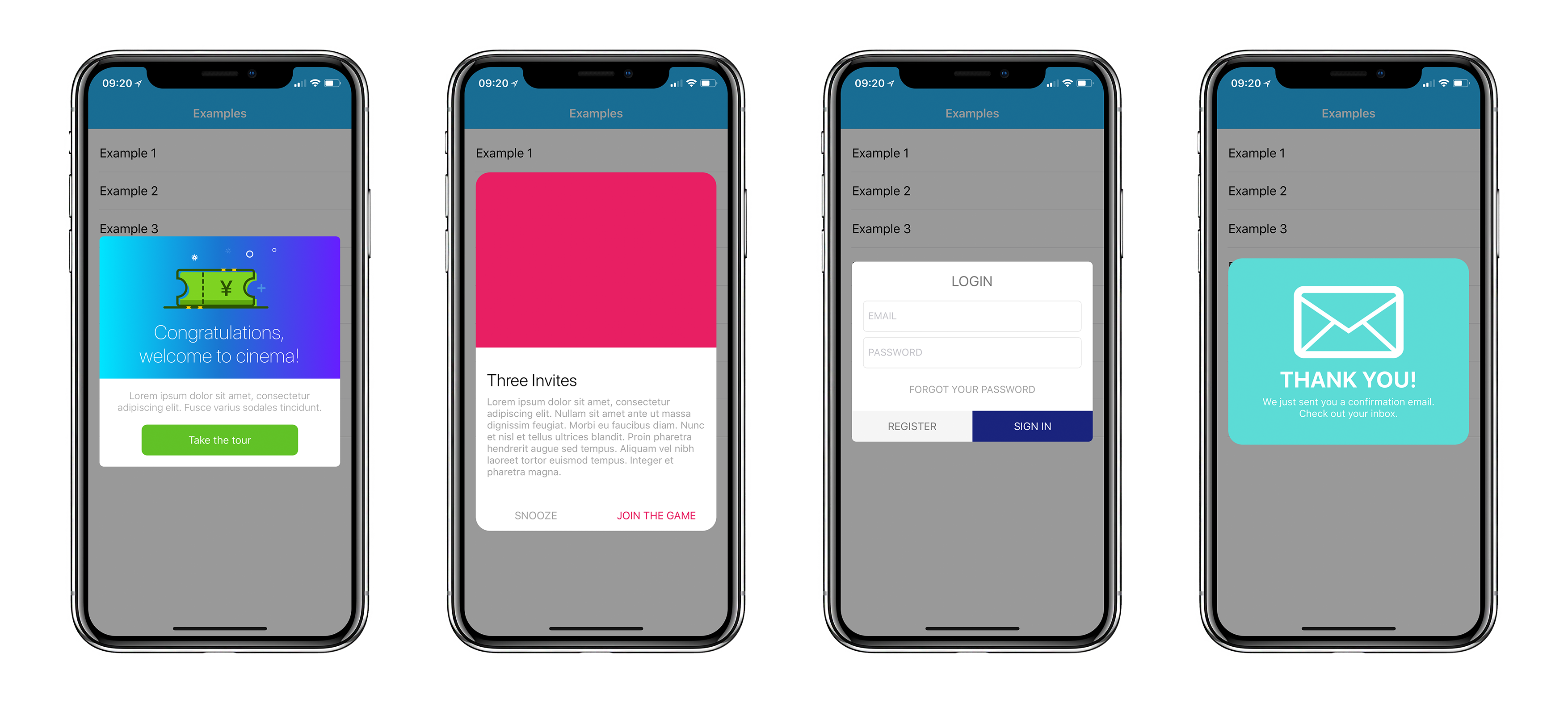
To run the example project, clone the repo, and run pod install from the Example directory first.
Requirements
- Xcode 10.0+
- Swift 5.0+
Versioning
- Swift 3.x: 1.1.5
- Swift 4.0: 2.0~3.0
- Swift 4.2: 3.1*
- Swift 5: 4.0
Installation
Pod
Malert is available through CocoaPods. To install it, simply add the following line to your Podfile:
pod ‘Malert’
Manually
If you don’t use any dependency managers, you can integrate Malert in your project manually just adding the files which contains Malert Classes.
Congratulations!!! You can run Malert without any dependency managers!
Example
This is a simple example. If you want to know more, check the app Example cause There are more than 10 customizated Malerts.
Malert with custom view
                                                import Malert
…
let view = ExampleView.instantiateFromNib()

let malert = Malert(customView: view)
let action = MalertAction(title: “OK”)

action.tintColor = UIColor(red:0.15, green:0.64, blue:0.85, alpha:1.0)
malert.addAction(action)
present(malert, animated: true)
How to create actions
To add buttons to your malert There is a function called addAction that you need to provide a MalertAction object to build customizable buttons.
                                                let malert = …
let action = MalertAction(title: “Take the tour”) {

print(“Closure called when action was clicked”)

}
action.cornerRadius = 8

action.tintColor = .white

action.backgroundColor = UIColor(red:0.38, green:0.76, blue:0.15, alpha:1.0)
malert.addAction(action)
…
For more details check the examples
Customize
Malert provides some attributes to cutomize it:
                                                /* Animation attr */

public var presentDuration: TimeInterval

public var dismissDuration: TimeInterval

public var animationType: MalertAnimationType
/* Container attr */

public var margin: CGFloat

public var cornerRadius: CGFloat

public var backgroundColor: UIColor?
/* Title attr */

public var titleFont: UIFont

public var textColor: UIColor

public var textAlign: NSTextAlignment
/* Buttons attr */

public var buttonsHeight: CGFloat

public var separetorColor: UIColor

public var buttonsSpace: CGFloat

public var buttonsSideMargin: CGFloat

public var buttonsBottomMargin: CGFloat

public var buttonsAxis: UILayoutConstraintAxis
It is very simple how you can do that. Just change malert’s attributes before present it:
                                                let exampleView = ExampleView()
let alert = Malert(customView: exampleView)
//customizing your malert
alert.animationType = .modalRight

alert.buttonsSideMargin = 60

alert.buttonsBottomMargin = 16

alert.buttonsAxis = .horizontal

alert.separetorColor = .clear
Customize actions
Malert enable some attributes to customize each action:
                                                public var tintColor: UIColor

public var backgroundColor: UIColor

public var cornerRadius: CGFloat

public var borderColor: UIColor

public var borderWidth: CGFloat
If you need more attributes to customize it, please let us know, create an issue or a pull request.
GitHub
#dialog #ios #swift #swiftlibrary
YOU MIGHT ALSO LIKE...

- August 27, 2025
- SwiftUI
This package provides you with an easy way to show tooltips over any SwiftUI view, since Apple does not provide ...
- August 27, 2025
- SwiftUI
- Uncategorized
SimpleToast is a simple, lightweight, flexible and easy to use library to show toasts / popup notifications inside iOS or ...
- August 27, 2025
- SwiftUI
Create Toast Views with Minimal Effort in SwiftUI Using SSToastMessage. SSToastMessage enables you to effortlessly add toast notifications, alerts, and ...

- August 27, 2025
- Mins Read
- August 27, 2025
- Mins Read
- August 27, 2025
- Mins Read
- August 22, 2025
- Mins Read
