- August 28, 2025
- Mins Read
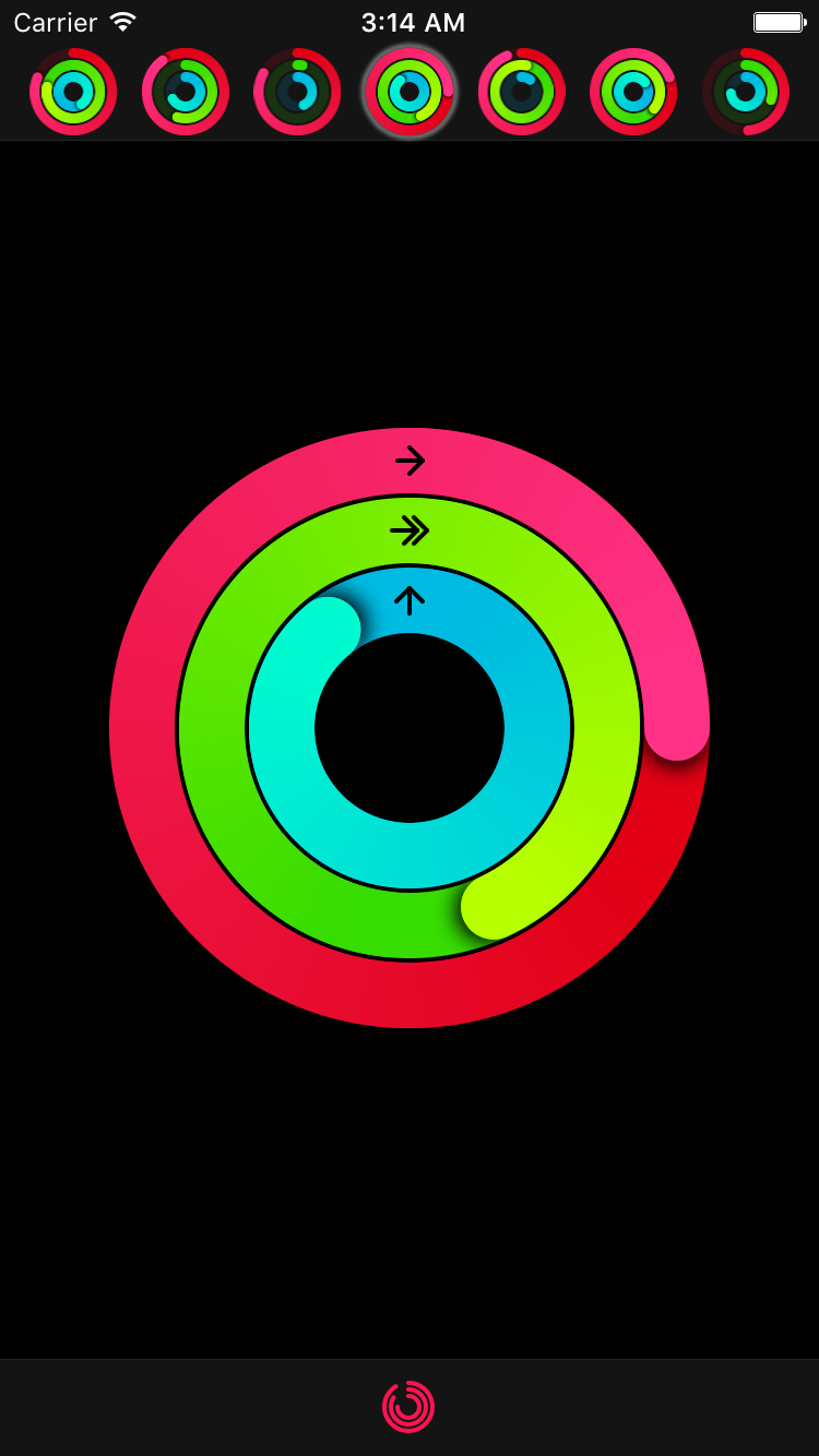
Ring progress view similar to Activity app on Apple Watch
Features
- Progress animation
- Customizable start/end and backdrop ring colors
- Customizable ring width
- Customizable progress line end style
- Customizable shadow under progress line end
- Progress values above 100% (or 360°) can also be displayed
Installation
CocoaPods
To install MKRingProgressView via CocoaPods, add the following line to your Podfile:
pod ‘MKRingProgressView’
Carthage
To install MKRingProgressView via Carthage, add the following line to your Cartfile:
github “maxkonovalov/MKRingProgressView”
Swift Package Manager
Note: Instructions below are for using SwiftPM without the Xcode UI. It’s the easiest to go to your Project Settings -> Swift Packages and add MKRingProgressView from there.
To integrate using Apple’s Swift package manager, without Xcode integration, add the following as a dependency to your Package.swift:
.package(url: “https://github.com/maxkonovalov/MKRingProgressView.git”, .upToNextMajor(from: “2.3.0”))
Usage
See the example Xcode project. It contains 2 targets:
- ProgressRingExample – a simple example containing a single progress ring with adjustable parameters.
- ActivityRingsExample – an advanced usage example replicating Activity app by Apple. It also contains additional classes for convenient grouping of 3 ring progress views together.
Interface Builder
MKRingProgressView can be set up in Interface Builder. To use it, set the custom view class to MKRingProgressView. Most of the control’s parameters can be customized in Interface Builder.
Code
                                                let ringProgressView = RingProgressView(frame: CGRect(x: 0, y: 100, width: 100, height: 100))

ringProgressView.startColor = .red

ringProgressView.endColor = .magenta

ringProgressView.ringWidth = 25

ringProgressView.progress = 0.0

view.addSubview(ringProgressView)
The progress value can be animated the same way you would normally animate any property using UIView‘s block-based animations:
                                                UIView.animate(withDuration: 0.5) {

ringProgressView.progress = 1.0

}
Performance
To achieve better performance the following options are possible:
- Set
gradientImageScaleto lower values like0.5(defaults to1.0) - Set
startColorandendColorto the same value - Set
shadowOpacityto0.0 - Set
allowsAntialiasingtofalse
Requirements
- iOS 9.0
- tvOS 9.0
GitHub
#apple #circle #gradient #ios #progress #progressbar #progresscircle #progressview #ring #swift
YOU MIGHT ALSO LIKE...

- August 27, 2025
- SwiftUI
This package provides you with an easy way to show tooltips over any SwiftUI view, since Apple does not provide ...
- August 27, 2025
- SwiftUI
- Uncategorized
SimpleToast is a simple, lightweight, flexible and easy to use library to show toasts / popup notifications inside iOS or ...
- August 27, 2025
- SwiftUI
Create Toast Views with Minimal Effort in SwiftUI Using SSToastMessage. SSToastMessage enables you to effortlessly add toast notifications, alerts, and ...

- August 27, 2025
- Mins Read
- August 27, 2025
- Mins Read
- August 27, 2025
- Mins Read
- August 22, 2025
- Mins Read
