- August 28, 2025
- Mins Read
| Floaters | Toasts | Popups | Sheets |
|---|---|---|---|
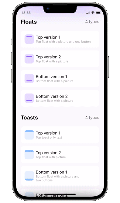 |
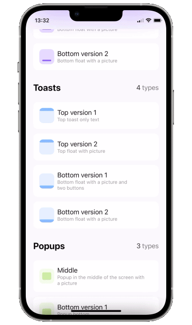 |
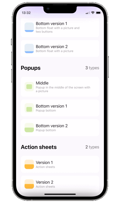 |
 |
Popup View
What’s new in version 4
You can show multiple popups on top of anything, and they can also let the taps pass through to lower views. There are 3 ways to display a popup: as a simple overlay, using SwiftUI’s fullscreenSheet, and using UIKit’s UIWindow. There are pros and cons for all of these, here is a table.
| Overlay | Sheet | Window | |
|---|---|---|---|
| Show on top of navbar | ❌ | ✅ | ✅ |
| Show on top of sheet | ❌ | ❌ | ✅ |
| Show multiple popups | ✅ | ❌ | ✅ |
| Taps “pass through” the transparent bg | ✅ | ❌ | ✅ |
| SwiftUI @State update mechanism works as expected | ✅ | ✅ | ❌ |
Basically UIWindow based popup is the best option for most situations, just remember – to get adequate UI updates, use ObservableObjects or @Bindings instead of @State. This won’t work:
                                                struct ContentView : View {

@State var showPopup = false

@State var a = false
var body: some View {

Button(“Button”) {

showPopup.toggle()

}

.popup(isPresented: $showPopup) {

VStack {

Button(“Switch a”) {

a.toggle()

}

a ? Text(“on”).foregroundStyle(.green) : Text(“off”).foregroundStyle(.red)

}

} customize: {

$0

.type(.floater())

.closeOnTap(false)

.position(.top)

}

}

}
This will work:
                                                struct ContentView : View {

@State var showPopup = false

@State var a = false
var body: some View {

Button(“Button”) {

showPopup.toggle()

}

.popup(isPresented: $showPopup) {

PopupContent(a: $a)

} customize: {

$0

.type(.floater())

.closeOnTap(false)

.position(.top)

}

}

}
struct PopupContent: View {

@Binding var a: Bool
var body: some View {

VStack {

Button(“Switch a”) {

a.toggle()

}

a ? Text(“on”).foregroundStyle(.green) : Text(“off”).foregroundStyle(.red)

}

}

}
Update to version 4
New DisplayMode enum was introduced instead of isOpaque. isOpaque is now deprecated. Instead of:
                                                .popup(isPresented: $toasts.showingTopSecond) {

ToastTopSecond()

} customize: {

$0

.type(.toast)

.isOpaque(true) // <– here

}
use:
                                                .popup(isPresented: $floats.showingTopFirst) {

FloatTopFirst()

} customize: {

$0

.type(.floater())

.displayMode(.sheet) // <– here

}
So, new .displayMode(.sheet) corresponds to old .isOpaque(true), .displayMode(.overlay) corresponds to .isOpaque(false). Default DisplayMode is .window.
What’s new in version 3
- zoom in/out appear/disappear animations
disappearToparameter to specify disappearing animation direction – can be different fromappearFrom
Update to version 3
To include new .zoom type, AppearFrom enum cases were renamed. Instead of:
                                                .popup(isPresented: $floats.showingTopFirst) {

FloatTopFirst()

} customize: {

$0

.type(.floater())

.appearFrom(.top) // <– here

}
use:
                                                .popup(isPresented: $floats.showingTopFirst) {

FloatTopFirst()

} customize: {

$0

.type(.floater())

.appearFrom(.topSlide) // <– here

}
Update to version 2
Instead of:
                                                .popup(isPresented: $floats.showingTopFirst, type: .floater(), position: .top, animation: .spring(), closeOnTapOutside: true, backgroundColor: .black.opacity(0.5)) {

FloatTopFirst()

}
use:
                                                .popup(isPresented: $floats.showingTopFirst) {

FloatTopFirst()

} customize: {

$0

.type(.floater())

.position(.top)

.animation(.spring())

.closeOnTapOutside(true)

.backgroundColor(.black.opacity(0.5))

}
Using this API you can pass parameters in any order you like.
Usage
- Add a bool to control popup presentation state
- Add
.popupmodifier to your view.
                                                import PopupView
struct ContentView: View {
@State var showingPopup = false
var body: some View {

YourView()

.popup(isPresented: $showingPopup) {

Text(“The popup”)

.frame(width: 200, height: 60)

.background(Color(red: 0.85, green: 0.8, blue: 0.95))

.cornerRadius(30.0)

} customize: {

$0.autohideIn(2)

}

}

}
Required parameters
isPresented – binding to determine if the popup should be seen on screen or hidden
view – view you want to display on your popup
or
item – binding to item: if item’s value is nil – popup is hidden, if non-nil – displayed. Be careful – library makes a copy of your item during dismiss animation!!
view – view you want to display on your popup
Available customizations – optional parameters
use customize closure in popup modifier:
type:
default– usual popup in the center of screen- toast – fitted to screen i.e. without padding and ignoring safe area
- floater – has padding and can choose to use or ignore safe area
- scroll – adds a scroll to your content, if you scroll to top of this scroll – the gesture will continue into popup’s drag dismiss.
-
floater parameters:
verticalPadding– padding which will define padding from the relative vertical edge or will be added to safe area ifuseSafeAreaInsetis truehorizontalPadding– padding which will define padding from the relative horizontal edge or will be added to safe area ifuseSafeAreaInsetis trueuseSafeAreaInset– whether to include safe area insets in floater padding
scroll parameters:
headerView– a view on top which won’t be a part of the scroll (if you need one)position– topLeading, top, topTrailing, leading, center, trailing, bottomLeading, bottom, bottomTrailingappearFrom–topSlide, bottomSlide, leftSlide, rightSlide, centerScale, none: determines the direction of appearing animation. If left empty it copiespositionparameter: so appears from .top edge, ifpositionis set to .top..nonemeans no animationdisappearTo– same asappearFrom, but for disappearing animation. If left empty it copiesappearFrom.animation– custom animation for popup sliding onto screen
autohideIn– time after which popup should disappear
dismissibleIn(Double?, Binding<Bool>?)– only allow dismiss after this time passes (forbids closeOnTap, closeOnTapOutside, and drag). Pass a boolean binding if you’d like to track current status
dragToDismiss– true by default: enable/disable drag to dismiss (upwards for .top popup types, downwards for .bottom and default type)
closeOnTap– true by default: enable/disable closing on tap on popup
closeOnTapOutside– false by default: enable/disable closing on tap on outside of popup
allowTapThroughBG– Should allow taps to pass “through” the popup’s background down to views “below” it. -
.sheetpopup is always allowTapThroughBG = false
backgroundColor– Color.clear by default: change background color of outside area
backgroundView– custom background builder for outside area (if this one is setbackgroundColoris ignored)
isOpaque– false by default: if true taps do not pass through popup’s background and the popup is displayed on top of navbar. For more see section “Show over navbar”
useKeyboardSafeArea– false by default: if true popup goes up for keyboardHeight when keyboard is displayeddismissCallback– custom callback to call once the popup is dismissedDraggable card – sheet
To implement a sheet (like in 4th gif) enable
dragToDismisson bottom toast (see example project for implementation of the card itself)
                                                .popup(isPresented: $show) {

// your content

} customize: {

$0

.type (.toast)

.position(.bottom)

.dragToDismiss(true)

}
Examples
To try the PopupView examples:
- Clone the repo
https://github.com/exyte/PopupView.git - Open
PopupExample.xcodeprojin the Xcode - Try it!
Installation
Swift Package Manager
                                                dependencies: [

.package(url: “https://github.com/exyte/PopupView.git”)

]
Requirements
- iOS 15.0+ / macOS 11.0+ / tvOS 14.0+ / watchOS 7.0+
- Xcode 12+
GitHub
YOU MIGHT ALSO LIKE...

- August 27, 2025
- SwiftUI
This package provides you with an easy way to show tooltips over any SwiftUI view, since Apple does not provide ...
- August 27, 2025
- SwiftUI
- Uncategorized
SimpleToast is a simple, lightweight, flexible and easy to use library to show toasts / popup notifications inside iOS or ...
- August 27, 2025
- SwiftUI
Create Toast Views with Minimal Effort in SwiftUI Using SSToastMessage. SSToastMessage enables you to effortlessly add toast notifications, alerts, and ...

- August 27, 2025
- Mins Read
- August 27, 2025
- Mins Read
- August 27, 2025
- Mins Read
- August 22, 2025
- Mins Read
