- August 28, 2025
- Mins Read
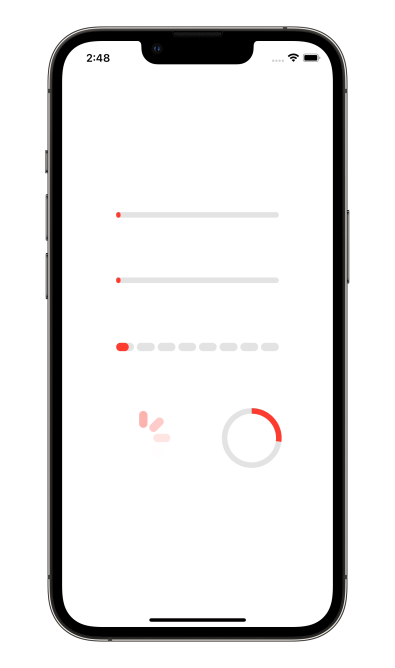
A number of preset progress indicators created with SwiftUI
Usage
Create a progress indicator like this:
ProgressIndicatorView(isVisible: $showProgressIndicator, type: .bar(progress: $progress))
where
showProgressIndicator – bool value you may change to display or hide the indicator
type – value from ProgressIndicatorView.IndicatorType enum
You may alter it with standard SwiftUI means like this:
                                                ProgressIndicatorView(isVisible: $showProgressIndicator, type: .bar(progress: $progress))

.frame(width: 50.0, height: 50.0)

.foregroundColor(.red)
Indicator types
default – progress indicator looks like default iOS UIActivityIndicator.
bar – line progress bar with a Binding progress value and background color, default is Color.clear:
                                                ProgressIndicatorView(isVisible: $showProgressIndicator, type: .bar(progress: $progress, backgroundColor: .gray)

.frame(height: 8.0)

.foregroundColor(.red)
impulseBar – impulse line bar, works as bar indicator with an impulse effect.
dashBar – discrete line bar, with number of pieces, default is 8:
                                                ProgressIndicatorView(isVisible: $showProgressIndicator, type: .dashBar(progress: $progress, numberOfItems: 8))

.frame(height: 8.0)

.foregroundColor(.red)
circle – cirle progress indicator, with lineWidth and strokeColor:
                                                ProgressIndicatorView(isVisible: $showProgressIndicator, type: .circle(progress: $progress, lineWidth: 8.0, strokeColor: .red))

.frame(height: 8.0)

.foregroundColor(.red)
Examples
To try out the ProgressIndicatorView examples:
- Clone the repo
git clone git@github.com:exyte/ProgressIndicatorView.git - Open terminal and run
cd <ProgressIndicatorViewRepo>/Example - Run
pod installto install all dependencies - Run
xed .to open project in the Xcode - Try it!
Installation
Swift Package Manager
                                                dependencies: [

.package(url: “https://github.com/exyte/ProgressIndicatorView.git”, from: “0.0.1”)

]
CocoaPods
pod ‘ProgressIndicatorView’
Carthage
github “Exyte/ProgressIndicatorView”
Requirements
- iOS 13+ / watchOS 6+ / tvOS 13+ / macOS 10.15+
- Xcode 11+
Our other open source SwiftUI libraries
PopupView – Toasts and popups library
Grid – The most powerful Grid container
ScalingHeaderScrollView – A scroll view with a sticky header which shrinks as you scroll
AnimatedTabBar – A tabbar with number of preset animations
MediaPicker – Customizable media picker
Chat – Chat UI framework with fully customizable message cells, input view, and a built-in media picker
ConcentricOnboarding – Animated onboarding flow
FloatingButton – Floating button menu
ActivityIndicatorView – A number of animated loading indicators
SVGView – SVG parser
LiquidSwipe – Liquid navigation animation
GitHub
#ios #loadingview #swift #uiactivityindicatorview
YOU MIGHT ALSO LIKE...

- August 27, 2025
- SwiftUI
This package provides you with an easy way to show tooltips over any SwiftUI view, since Apple does not provide ...
- August 27, 2025
- SwiftUI
- Uncategorized
SimpleToast is a simple, lightweight, flexible and easy to use library to show toasts / popup notifications inside iOS or ...
- August 27, 2025
- SwiftUI
Create Toast Views with Minimal Effort in SwiftUI Using SSToastMessage. SSToastMessage enables you to effortlessly add toast notifications, alerts, and ...

- August 27, 2025
- Mins Read
- August 27, 2025
- Mins Read
- August 27, 2025
- Mins Read
- August 22, 2025
- Mins Read
