
- August 28, 2025
- Mins Read
Animated Alert View written in Swift, which can be used as a UIAlertView or UIAlertController replacement with nice customization features.
Easy to use
Get Started
                                                // Get started

SCLAlertView().showInfo(“Important info”, subTitle: “You are great”)
Updating the alert view
                                                let alertViewResponder: SCLAlertViewResponder = SCLAlertView().showSuccess(“Hello World”, subTitle: “This is a more descriptive text.”)
// Upon displaying, change/close view

alertViewResponder.setTitle(“New Title”) // Rename title

alertViewResponder.setSubTitle(“New description”) // Rename subtitle

alertViewResponder.close() // Close view
Alternative alert types
                                                SCLAlertView().showError(“Hello Error”, subTitle: “This is a more descriptive error text.”) // Error

SCLAlertView().showNotice(“Hello Notice”, subTitle: “This is a more descriptive notice text.”) // Notice

SCLAlertView().showWarning(“Hello Warning”, subTitle: “This is a more descriptive warning text.”) // Warning

SCLAlertView().showInfo(“Hello Info”, subTitle: “This is a more descriptive info text.”) // Info

SCLAlertView().showEdit(“Hello Edit”, subTitle: “This is a more descriptive info text.”) // Edit
Raw call to showTitle()
                                                SCLAlertView().showTitle(

“Congratulations”, // Title of view

subTitle: “Operation successfully completed.”, // String of view

duration: 2.0, // Duration to show before closing automatically, default: 0.0

completeText: “Done”, // Optional button value, default: “”

style: .success, // Styles – see below.

colorStyle: UIColorFromRGB(0xA429FF),

colorTextButton: .white

)
Controls
Custom Appearance
                                                // SCLAlertView.SCLAppearanc has more than 15 different properties to customize. See below.
let appearance = SCLAlertView.SCLAppearance(

kTitleFont: UIFont(name: “HelveticaNeue”, size: 20)!,

kTextFont: UIFont(name: “HelveticaNeue”, size: 14)!,

kButtonFont: UIFont(name: “HelveticaNeue-Bold”, size: 14)!,

showCloseButton: false

)
let alert = SCLAlertView(appearance: appearance)
Add buttons
                                                let alertView = SCLAlertView()

alertView.addButton(“First Button”, target:self, selector:Selector(“firstButton”))

alertView.addButton(“Second Button”) {

print(“Second button tapped”)

}

alertView.showSuccess(“Button View”, subTitle: “This alert view has buttons”)
Hide default close button
                                                let appearance = SCLAlertView.SCLAppearance(

showCloseButton: false

)

let alertView = SCLAlertView(appearance: appearance)

alertView.showSuccess(“No button”, subTitle: “You will have hard times trying to close me”)
Hide default close button & a duration to close the alert
                                                let appearance = SCLAlertView.SCLAppearance(

showCloseButton: false

)

let alertView = SCLAlertView(appearance: appearance)

alertView.showWarning(“No button”, subTitle: “Just wait for 3 seconds and I will disappear”, duration: 3)
Hide alert icon
                                                let appearance = SCLAlertView.SCLAppearance(

showCircularIcon: false

)

let alertView = SCLAlertView(appearance: appearance)

alertView.showSuccess(“No icon”, subTitle: “This is a clean alert without Icon!”)
Use a custom icon
                                                let appearance = SCLAlertView.SCLAppearance(

showCircularIcon: true

)

let alertView = SCLAlertView(appearance: appearance)

let alertViewIcon = UIImage(named: “IconImage”) //Replace the IconImage text with the image name

alertView.showInfo(“Custom icon”, subTitle: “This is a nice alert with a custom icon you choose”, circleIconImage: alertViewIcon)
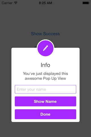
Add Text fields
                                                // Add a text field

let alert = SCLAlertView()

let txt = alert.addTextField(“Enter your name”)

alert.addButton(“Show Name”) {

print(“Text value: \(txt.text)”)

}

alert.showEdit(“Edit View”, subTitle: “This alert view shows a text box”)
Use a custom subview instead of a subtitle
                                                // Example of using the view to add two text fields to the alert

// Create custom Appearance Configuration

let appearance = SCLAlertView.SCLAppearance(

kTitleFont: UIFont(name: “HelveticaNeue”, size: 20)!,

kTextFont: UIFont(name: “HelveticaNeue”, size: 14)!,

kButtonFont: UIFont(name: “HelveticaNeue-Bold”, size: 14)!,

showCloseButton: false,

dynamicAnimatorActive: true

)
// Initialize SCLAlertView using custom Appearance

let alert = SCLAlertView(appearance: appearance)
// Creat the subview

let subview = UIView(frame: CGRect(x: 0,y: 0,width: 216,height: 70))

let x = (subview.frame.width – 180) / 2
// Add textfield 1

let textfield1 = UITextField(frame: CGRect(x: x,y: 10,width: 180,height: 25))

textfield1.layer.borderColor = UIColor.green.cgColor

textfield1.layer.borderWidth = 1.5

textfield1.layer.cornerRadius = 5

textfield1.placeholder = “Username”

textfield1.textAlignment = NSTextAlignment.center

subview.addSubview(textfield1)
// Add textfield 2

let textfield2 = UITextField(frame: CGRect(x: x,y: textfield1.frame.maxY + 10,width: 180,height: 25))

textfield2.isSecureTextEntry = true

textfield2.layer.borderColor = UIColor.blue.cgColor

textfield2.layer.borderWidth = 1.5

textfield2.layer.cornerRadius = 5

textfield1.layer.borderColor = UIColor.blue.cgColor

textfield2.placeholder = “Password”

textfield2.textAlignment = NSTextAlignment.center

subview.addSubview(textfield2)
// Add the subview to the alert’s UI property

alert.customSubview = subview

_ = alert.addButton(“Login”) {

print(“Logged in”)

}
// Add Button with visible timeout and custom Colors

let showTimeout = SCLButton.ShowTimeoutConfiguration(prefix: “(“, suffix: ” s)”)

_ = alert.addButton(“Timeout Button”, backgroundColor: UIColor.brown, textColor: UIColor.yellow, showTimeout: showTimeout) {

print(“Timeout Button tapped”)

}
let timeoutValue: TimeInterval = 10.0

let timeoutAction: SCLAlertView.SCLTimeoutConfiguration.ActionType = {

print(“Timeout occurred”)

}
_ = alert.showInfo(“Login”, subTitle: “”, timeout: SCLAlertView.SCLTimeoutConfiguration(timeoutValue: timeoutValue, timeoutAction: timeoutAction))
List of peoperties to customize
                                                // Button

kButtonFont: UIFont

buttonCornerRadius : CGFloat

showCloseButton: Bool

kButtonHeight: CGFloat
// Circle Image

showCircularIcon: Bool

kCircleTopPosition: CGFloat

kCircleBackgroundTopPosition: CGFloat

kCircleHeight: CGFloat

kCircleIconHeight: CGFloat
// Text

kTitleFont: UIFont

kTitleTop:CGFloat

kTitleHeight:CGFloat

kTextFont: UIFont

kTextHeight: CGFloat

kTextFieldHeight: CGFloat

kTextViewdHeight: CGFloat
// View

kDefaultShadowOpacity: CGFloat

kWindowWidth: CGFloat

kWindowHeight: CGFloat

shouldAutoDismiss: Bool // Set this false to ‘Disable’ Auto hideView when SCLButton is tapped

fieldCornerRadius : CGFloat

contentViewCornerRadius : CGFloat

disableTapGesture: Bool // set this to true if adding tableview to subView
Alert View Styles
                                                enum SCLAlertViewStyle: Int {

case success, error, notice, warning, info, edit, wait, question

}
Alert show animation Styles
                                                // Animation Styles

public enum SCLAnimationStyle {

case noAnimation, topToBottom, bottomToTop, leftToRight, rightToLeft

}
Installation
SCLAlertView is available through
CocoaPods
To install add the following line to your Podfile:
pod ‘SCLAlertView’
Carthage
To install add the following line to your Cartfile:
github "vikmeup/SCLAlertView-Swift" "master"
GitHub
#animation #carthage #cocoapods #ios #swift #textfield #uialertview
YOU MIGHT ALSO LIKE...

- August 27, 2025
- SwiftUI
This package provides you with an easy way to show tooltips over any SwiftUI view, since Apple does not provide ...
- August 27, 2025
- SwiftUI
- Uncategorized
SimpleToast is a simple, lightweight, flexible and easy to use library to show toasts / popup notifications inside iOS or ...
- August 27, 2025
- SwiftUI
Create Toast Views with Minimal Effort in SwiftUI Using SSToastMessage. SSToastMessage enables you to effortlessly add toast notifications, alerts, and ...

- August 27, 2025
- Mins Read
- August 27, 2025
- Mins Read
- August 27, 2025
- Mins Read
- August 22, 2025
- Mins Read
