
- August 28, 2025
- Mins Read
SwiftUI Flow Layout
SDFlowLayout is a fluid FlowLayout created with SwiftUI. This package is designed for iOS 14 and allows you to easily implement a GridView with flexible widths.
Requirements
iOS 14.0
macOS 11.0
Features
- Supports a GridView with flexible widths.
- Easily customizable using SwiftUI views.
- Compatible with various data collections.
Installation
You can install this package using Swift Package Manager. Add the following dependency to your Package.swift file:
You can install this package using Swift Package Manager. Add the following dependency to your Package.swift file:
Swift Package Manager
                                                /// Package.swift

/// …

dependencies: [

.package(url: “https://github.com/sanhee16/SDFlowLayout.git”, branch: “main”),

]

/// …
Usage
Here’s a simple example of how to use SDFlowLayout:
                                                import SwiftUI

import SDFlowLayout
struct ContentView: View {

private let colors: [Color] = [.red, .blue, .green, .orange, .pink, .yellow, .gray, .purple]

@StateObject private var vm: ContentVM = ContentVM()
var body: some View {

VStack {

SDFlowLayout(data: vm.items1, id: \.self) { item in

Text(item)

.padding()

.background(

RoundedRectangle(cornerRadius: 8)

.foregroundColor(self.colors.randomElement()?.opacity(0.5))

)

.padding(.trailing, 5)

}
Divider()

.padding(.vertical, 30)
SDFlowLayout(data: vm.items2, id: \.self) { item in

peopleView(item)

.padding(.trailing, 5)

}

}

.padding()

}
private func peopleView(_ item: People) -> some View {

HStack(alignment: .center, spacing: 0, content: {

Text(“\(item.name)”)

.padding(.trailing, 10)

Text(item.grade)

})

.padding()

.background(

RoundedRectangle(cornerRadius: 8)

.foregroundColor(self.colors.randomElement()?.opacity(0.5))

)

}

}
struct People: Equatable, Hashable {

var name: String

var age: Int

var grade: String

}
class ContentVM: ObservableObject {

@Published var items1: [String] = [“Mercury”, “Venus”, “Earth”, “Mars”, “Jupiter”, “Saturn”, “Uranus”, “Neptune”, “Pluto”]

@Published var items2: [People] = [

People(name: “Sandy”, age: 24, grade: “A”),

People(name: “Tom”, age: 24, grade: “B-“),

People(name: “Ruby”, age: 24, grade: “A+”),

People(name: “Jane”, age: 24, grade: “C+”),

People(name: “Mike”, age: 24, grade: “C-“),

People(name: “Teddy”, age: 24, grade: “D+”),

People(name: “Mat”, age: 24, grade: “B+”),

]

}

Do you want to create a hashtag view? You can do it!
                                                internal struct ContentView: View {

@State private var tags: [String] = [“Mercury”, “Venus”, “Earth”, “Mars”, “Jupiter”, “Saturn”, “Uranus”, “Neptune”, “Pluto”]
var body: some View {

VStack(alignment: .leading, spacing: 0) {

ScrollView(.vertical) {

VStack(alignment: .leading, spacing: 0, content: {

Text(“HashTag”)

.font(.headline)

.padding(.bottom, 10)
SDFlowLayout(data: $tags.wrappedValue.indices, id: \.self) { idx in

hashTagItem($tags.wrappedValue[idx], onTapDelete: {

$tags.wrappedValue.remove(at: idx)

})

.padding([.trailing, .bottom], 5)

}

})

.padding()

}

}

}
private func hashTagItem(_ text: String, onTapDelete: @escaping ()->()) -> some View {

HStack(alignment: .center, spacing: 0) {

Text(“#”)

Text(text)

.padding(.trailing, 4)

}

.padding(3)

}

}
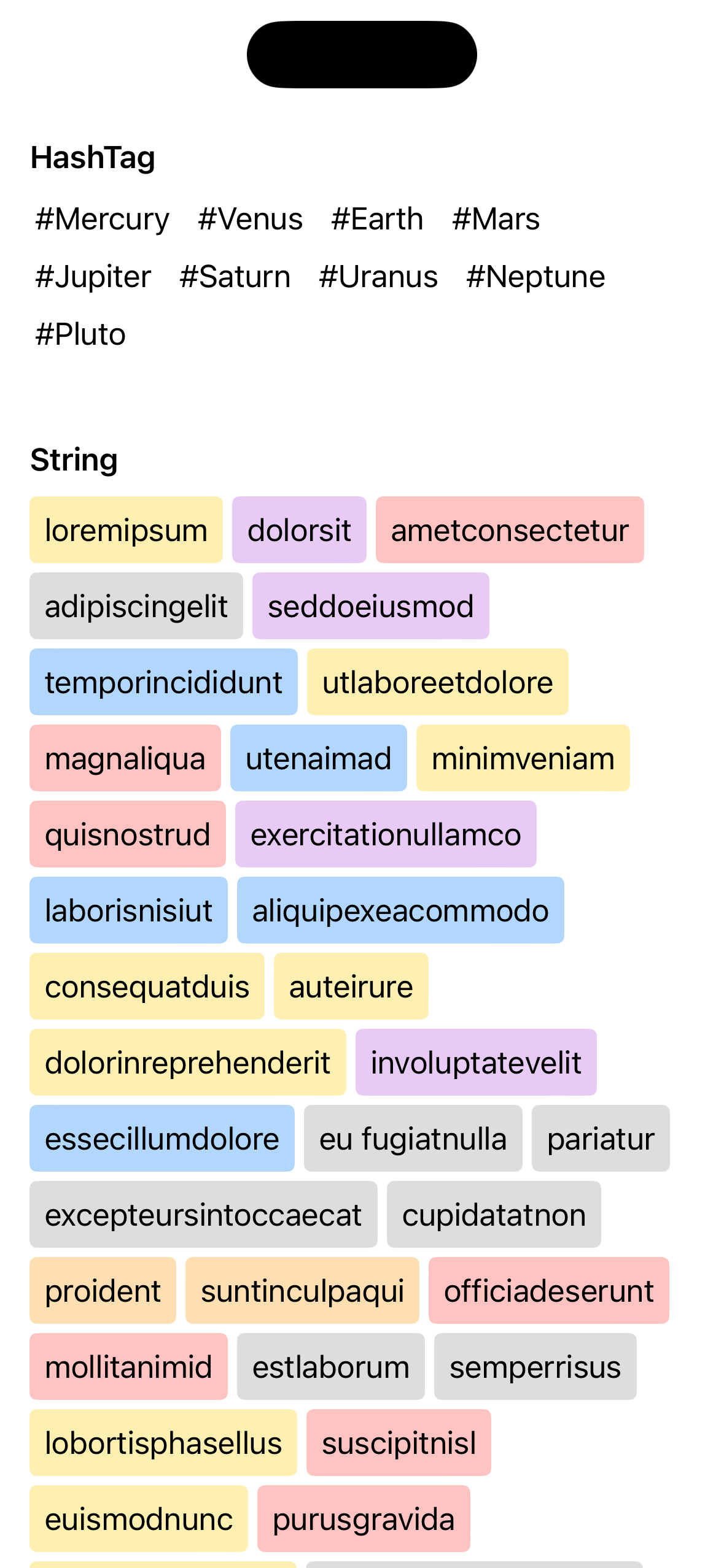
An example is available in ContentView!
Parameters
data: The collection of data to display.id: A key path to identify each data item.content: A closure that generates a view for each data item.
GitHub
#collectionview #gridlayout
YOU MIGHT ALSO LIKE...

- August 27, 2025
- SwiftUI
This package provides you with an easy way to show tooltips over any SwiftUI view, since Apple does not provide ...
- August 27, 2025
- SwiftUI
- Uncategorized
SimpleToast is a simple, lightweight, flexible and easy to use library to show toasts / popup notifications inside iOS or ...
- August 27, 2025
- SwiftUI
Create Toast Views with Minimal Effort in SwiftUI Using SSToastMessage. SSToastMessage enables you to effortlessly add toast notifications, alerts, and ...

- August 27, 2025
- Mins Read
- August 27, 2025
- Mins Read
- August 27, 2025
- Mins Read
- August 22, 2025
- Mins Read
