
- August 28, 2025
- Mins Read
Simple single-selection or multiple-selection checklist, based on UITableView.
Usage
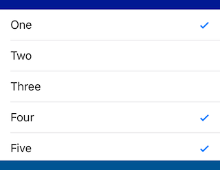
                                                let selectionList = SelectionList()

selectionList.items = [“One”, “Two”, “Three”, “Four”, “Five”]

selectionList.addTarget(self, action: #selector(selectionChanged), for: .valueChanged)

selectionList.selectedIndex = 3
Multiple Selection
                                                selectionList.allowsMultipleSelection = true

selectionList.selectedIndexes = [0, 1, 4]
Changing Appearance
The following properties can be changed either in Interface Builder or in code:
                                                selectionList.selectionImage = UIImage(named: “v”)

selectionList.deselectionImage = UIImage(named: “o”)

selectionList.isSelectionMarkTrailing = false // to put checkmark on left side

selectionList.rowHeight = 42.0
You can do additional styling in code:
                                                selectionList.setupCell = { (cell: UITableViewCell, index: Int) in

cell.textLabel?.textColor = .gray

}
If you want to remove the cells seperators
selectionList.tableView.separatorStyle = .none
Requirements
- iOS 9.0+
- Xcode 9+
Installation
CocoaPods
pod ‘SelectionList’
Legacy versions:
| Swift version | SelectionList version |
|---|---|
| 4.1 (Xcode 9.4) | pod 'SelectionList', '~> 1.2.0' |
| 4.0 | pod 'SelectionList', '~> 1.0.2' |
Swift Package Manager
                                                dependencies: [

.package(url: “https://github.com/yonat/SelectionList”, from: “1.4.2”)

]
GitHub
#checkbox #radiobuttons #swift #uitableview
YOU MIGHT ALSO LIKE...

- August 27, 2025
- SwiftUI
This package provides you with an easy way to show tooltips over any SwiftUI view, since Apple does not provide ...
- August 27, 2025
- SwiftUI
- Uncategorized
SimpleToast is a simple, lightweight, flexible and easy to use library to show toasts / popup notifications inside iOS or ...
- August 27, 2025
- SwiftUI
Create Toast Views with Minimal Effort in SwiftUI Using SSToastMessage. SSToastMessage enables you to effortlessly add toast notifications, alerts, and ...

- August 27, 2025
- Mins Read
- August 27, 2025
- Mins Read
- August 27, 2025
- Mins Read
- August 22, 2025
- Mins Read
