- August 28, 2025
- Mins Read
Clock UI for SwiftUI
This library has been tested
- ✅💻 macOS Catalina 10.15.3
- ✅💻 macOS Big Sur 11.6
- ✅📱 iOS 13
- ✅📱 iOS 14
- ✅📱 iOS 15
For compatibility with Xcode version older than 13.3, I would recommend to checkout the 1.4.x tag, it should compile with Xcode 11 and greater
Bind a date
                                                struct ContentView: View {

@State private var date = Date()
var body: some View {

ClockView().environment(\.clockDate, $date)

}

}
Simply set .environment(\.clockDate, $date) $date has to be a binding. If you want something constant (just for showing the time), you could pass .constant(yourDate)
- Arms move when date are set (take hour and minute in account)
- Move the Arms change the date (hour and minute depending on which arm you’ve moved)
Change Clock style
There is 4 different clock style:
| Style | Picture |
|---|---|
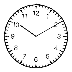
| Classic |  |
| Art Nouveau |  |
| Drawing |  |
| Steampunk |  |
To set the style: .environment(\.clockStyle, .steampunk) for Steampunk style for instance.
                                                struct ContentView: View {

@State private var clockStyle: ClockStyle = .classic
var body: some View {

ClockView().environment(\.clockStyle, clockStyle)

}

}
\.clockStyle is typed as enum ClockStyle which is Identifiable, CaseIterable, and has a convenient method to get the description (in English): public var description: String
It’s very useful when you want to iterate over this enum to let the user choose the clock style, for instance you can easily do something like this:
                                                struct StylePicker: View {

@Binding var clockStyle: ClockStyle
var body: some View {

Picker(“Style”, selection: clockStyle) {

ForEach(ClockStyle.allCases) { style in

Text(style.description).tag(style)

}

}

.pickerStyle(SegmentedPickerStyle())

}

}
Change elements color
You can also change the color of Clock elements. Again with changing some .environment keys.
                                                ClockView()

.environment(\.clockArmColors, ClockArmColors(

minute: .red,

hour: .blue

))

.environment(\.clockBorderColor, .orange)

.environment(\.clockIndicatorsColor, .green)
In light mode, you could expect a result like this:
Installation
Xcode
You can add SwiftToTen to an Xcode project by adding it as a package dependency.
- From the File menu, select Swift Packages › Add Package Dependency…
- Enter “https://github.com/renaudjenny/SwiftClockUI” into the package repository URL test field
As package dependency
Edit your Package.swift to add this library.
                                                let package = Package(

…

dependencies: [

.package(url: “https://github.com/renaudjenny/SwiftClockUI”, from: “2.0.0”),

…

],

targets: [

.target(

name: “<Your project name>”,

dependencies: [“SwiftClockUI”]),

…

]

)
GitHub
- August 27, 2025
- SwiftUI
This package provides you with an easy way to show tooltips over any SwiftUI view, since Apple does not provide ...
- August 27, 2025
- SwiftUI
- Uncategorized
SimpleToast is a simple, lightweight, flexible and easy to use library to show toasts / popup notifications inside iOS or ...
- August 27, 2025
- SwiftUI
Create Toast Views with Minimal Effort in SwiftUI Using SSToastMessage. SSToastMessage enables you to effortlessly add toast notifications, alerts, and ...


