- August 28, 2025
- Mins Read
SwiftyDrop is a lightweight pure Swift simple and beautiful dropdown message.
Features
- Easy to use like:
Drop.down("Message") - Message field expands depending on the message.
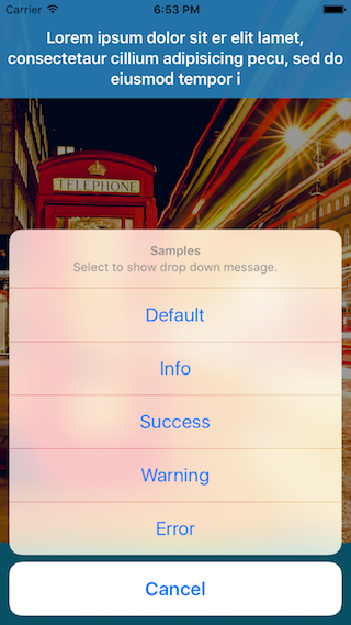
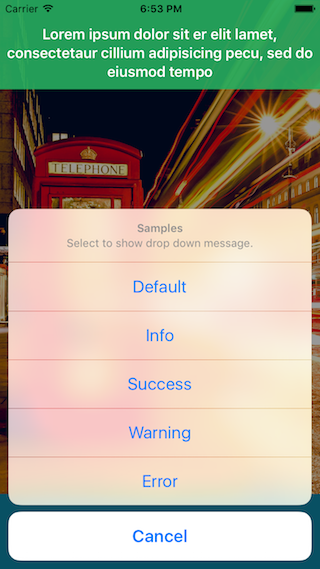
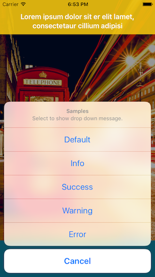
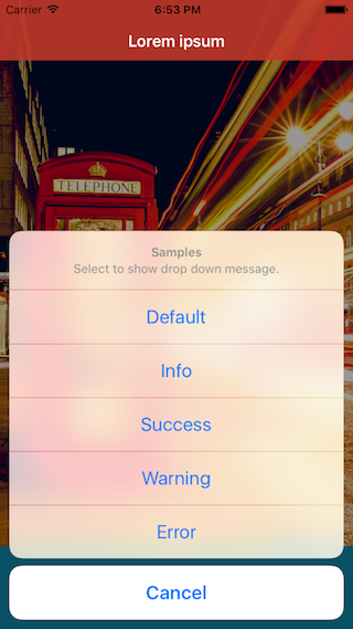
How it looks
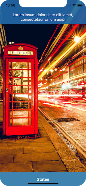
States
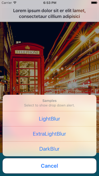
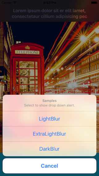
Blurs
iPhone X
iPad

Demo
Git clone or download this repository and open SwiftyDrop.xcodeproj . You can try SwiftyDrop in your Mac or iPhone.
Runtime Requirements
- iOS8.0 or later
- Xcode 9.0
- Swift 4.0
Installation and Setup
Note: Embedded frameworks require a minimum deployment target of iOS 8.1.
Information: To use SwiftyDrop with a project targeting iOS 8.0 or lower, you must include the SwiftyDrop/Drop.swift source file directly in your project.
Installing with CocoaPods
CocoaPods is a centralised dependency manager that automates the process of adding libraries to your Cocoa application. You can install it with the following command:
                                                $ gem update

$ gem install cocoapods

$ pods –version
To integrate SwiftyDrop into your Xcode project using CocoaPods, specify it in your Podfile and run pod install.
                                                platform :ios, ‘8.0’

use_frameworks!

pod ‘SwiftyDrop’, ‘~>4.0’
Installing with Carthage
Just add to your Cartfile:
github “morizotter/SwiftyDrop” ~> 4.0
Manual Installation
To install SwiftyDrop without a dependency manager, please add all of the files in /SwiftyDrop to your Xcode Project.
Usage
Basic
To start using SwiftyDrop, write the following line wherever you want to show dropdown message:
import SwiftyDrop
Then invoke SwiftyDrop, by calling:
Drop.down(“Message”)
It is really simple!
State
SwiftyDrop has states of display.
Examples
                                                Drop.down(“Message”)

Drop.down(“Message”, state: .Success)

Drop.down(“Message”, state: .Color(.orangeColor()))

Drop.down(“Message”, state: .Blur(.Light))
Custom states
You can customize looks by comforming DropStatable protocol. Examples are:
                                                enum Custom: DropStatable {

case BlackGreen

var backgroundColor: UIColor? {

switch self {

case .BlackGreen: return .blackColor()

}

}

var font: UIFont? {

switch self {

case .BlackGreen: return UIFont(name: “HelveticaNeue-Light”, size: 24.0)

}

}

var textColor: UIColor? {

switch self {

case .BlackGreen: return .greenColor()

}

}

var blurEffect: UIBlurEffect? {

switch self {

case .BlackGreen: return nil

}

}

}
Drop.down(self.sampleText(), state: Custom.BlackGreen)
Of course you can use class or struct to make custom state if it is comforming to DropStatable protocol.
Prepared States are enum:
- .Default
- .Info
- .Success
- .Warning
- .Error
- .Color: UIColor
- .Blur: UIBlurEffectStyle
Duration
Drop.down(“Message”, duration: 3.0)
You can change duration like this above. Default duration is 4.0.
Action
                                                Drop.down(“Message”) {

print(“Action fired!”)

}
GitHub
#carthage #cocoapods #dropdown #expand #ios #swift #xcode
YOU MIGHT ALSO LIKE...

- August 27, 2025
- SwiftUI
This package provides you with an easy way to show tooltips over any SwiftUI view, since Apple does not provide ...
- August 27, 2025
- SwiftUI
- Uncategorized
SimpleToast is a simple, lightweight, flexible and easy to use library to show toasts / popup notifications inside iOS or ...
- August 27, 2025
- SwiftUI
Create Toast Views with Minimal Effort in SwiftUI Using SSToastMessage. SSToastMessage enables you to effortlessly add toast notifications, alerts, and ...

- August 27, 2025
- Mins Read
- August 27, 2025
- Mins Read
- August 27, 2025
- Mins Read
- August 22, 2025
- Mins Read
