
- August 28, 2025
- Mins Read
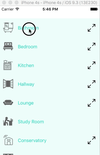
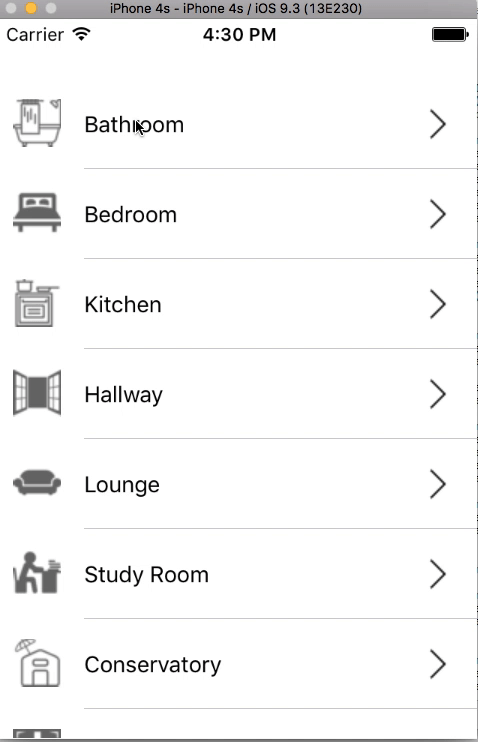
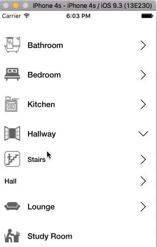
ThreeLevelAccordian is a three level accordian for IOS. It owes its base code to SwiftyAccordionCells. Most of the design is customisable. It goes till three levels. You can customise the font, color, background color of items, add image to them etc. The innermost items can be multiline too. If an element does not have any child elements, expand icon is not shown against them.
Example
To run the example project, clone the repo, and run pod install from the Example directory first.
Requirements
ios 8.0+
Installation
ThreeLevelAccordian is available through CocoaPods. To install it, simply add the following line to your Podfile:
pod “ThreeLevelAccordian”
##Basic Usage There are three types of cells for three levels of Arcadian: 1) TLAHeaderItem: This is the highest level cell. 2) TLACell: This is the second level cell. 3) TLASubItem: This is the innermost cell.
                                                Setup your tableView whichever way you want before initializing ThreeLevelAccordian. If you wish, you can set the background color    and other properties, and they will be retained if you do not override them with options.
Find the basic code below:
import ThreeLevelAccordian
class ViewController: UIViewController, TLADelegate {

@IBOutlet weak var tableView: UITableView!

var cells = [TLACell]()

var delegateController: TLAViewController! //This is very very important
override func viewDidLoad() {

super.viewDidLoad()
//Populating data

cells.append(TLAHeaderItem(value: “Header1”, imageURL: “headerImage1”))

cells.append(TLACell(value: “Middle item1”, imageURL: “cellImage1”))

cells.append(TLASubItem(value: “Lower item1”, imageURL: “subItemImage1”))

cells.append(TLACell(value: “Middle item2”, imageURL: “cellImage2”))

cells.append(TLASubItem(value: “Lower item2”, imageURL: “subItemImage2”))

cells.append(TLACell(value: “Middle item3”, imageURL: “cellImage3”))
cells.append(TLAHeaderItem(value: “Header2”, imageURL: “headerImage2”))

cells.append(TLACell(value: “Middle item21”, imageURL: “cellImage2”))

cells.append(TLASubItem(value: “Lower item21”, imageURL: “subItemImage2”))

cells.append(TLACell(value: “Middle item22”))
//Customisation properties..This part is optional

let options: [TLAOption] = [

.CellBackgroundColor(UIColor.whiteColor()),

.CellColor(textColor),

.CellFont(UIFont(name: “HelveticaNeue-Medium”, size: 14.0)!),

.CellHeight(44.0),

.UseSingleValues(true),
.UseAccessoryIcons(true),

.ExpandIcon(UIImage(named: “MyExpandIcon.png”)!),

.CollapseIcon(UIImage(named: “MyCollapseIcon.png”)!),

]
//Not optional 🙂

//Specify for cell reuse identifier here

let threeLevelAccordian = ThreeLevelAccordian.init(cells: cells, options: options, reuseIdentifier: “checklistAccordianCell”)

threeLevelAccordian.delegate = self
//The next three lines are extremely important

delegateController = threeLevelAccordian.controller

tableView.dataSource = delegateController

tableView.delegate = delegateController
tableView.reloadData()

}
//Delegate function

func didSelectItemAtIndex(index: Int) {

let alertController = UIAlertController(title: “Clicked”, message: “Clicked \(index)”, preferredStyle: UIAlertControllerStyle.Alert)

alertController.addAction(UIAlertAction(title: “Ok”, style: UIAlertActionStyle.Cancel, handler: nil))

self.presentViewController(alertController, animated: true, completion: nil)

}

}
Customisations
                                                You can either specify single customisation values for all cell types through the parameters given below:

1) CellBackgroundColor

2) CellColor: Text color

3) CellHeight

4) CellFont

If you want to apply these values, make sure you mark UseSingleValues to true
You can also provide cell type specific customisations. The names are self explanatory.

For TLAHeaderItem

1) HeaderTextFont

2) HeaderTextColor

3) HeaderCellBackgroundColor

4) HeaderCellHeight
For TLACell

1) ItemTextFont

2) ItemTextColor

3) ItemCellBackgroundColor

4) ItemCellHeight
For TLASubItem

1) SubItemTextFont

2) SubItemTextColor

3) SubItemCellBackgroundColor

4) SubItemCellHeighti

5) IsMultiline: Mark this as true if you are expecting your text to be too big for a single line.
Also, if you want default styling that comes with tables, you can pass options as nil.
There is expand and collapse icons shown on default for appropriate rows (that is, if the row can be expanded or needs to be collapsed). You can turn it off or set your own icons for expand or collapse. Parameters for the same are:

1) UseAccessoryIcons: mark false if you do not want to show expand/collapse icons

2) ExpandIcon

3) CollapseIcon
You can use these options as shown in the Basic Usage section.
GitHub
#autolayout #cocoa #cocoapod #cocoapods #cocoatouch #collection #collectionkit #collectionview #collectionviewcell #collectionviewlayout #customlayout #dynamic #expandabletableview #flowlayout #hashtag #hashtags #ibinspectable #indexpath #instagram #instagramanimation #ios #iosanimation #iosdevelopment #iossdk #iosswift #iosthirdparty #lightboxalgorithm #objectivec #swift #swiftanimation #swiftcollection #swiftimage #swiftlibrary #swiftpackagemanager #swiftui #swiftuicomponents #table #tableview #tableviewcell #taglistview #tags #tagsview #uicollectionview #uicollectionviewanimation #uicollectionviewcell #uicollectionviewflowlayout #uicollectionviewlayout #uitableview #uitableviewcell #uitableviewcocoapods #uitableviewcontroller #xcode
YOU MIGHT ALSO LIKE...

- August 27, 2025
- SwiftUI
This package provides you with an easy way to show tooltips over any SwiftUI view, since Apple does not provide ...
- August 27, 2025
- SwiftUI
- Uncategorized
SimpleToast is a simple, lightweight, flexible and easy to use library to show toasts / popup notifications inside iOS or ...
- August 27, 2025
- SwiftUI
Create Toast Views with Minimal Effort in SwiftUI Using SSToastMessage. SSToastMessage enables you to effortlessly add toast notifications, alerts, and ...

- August 27, 2025
- Mins Read
- August 27, 2025
- Mins Read
- August 27, 2025
- Mins Read
- August 22, 2025
- Mins Read
