- August 28, 2025
- Mins Read
Android-like toast with very simple interface. (formerly JLToast)
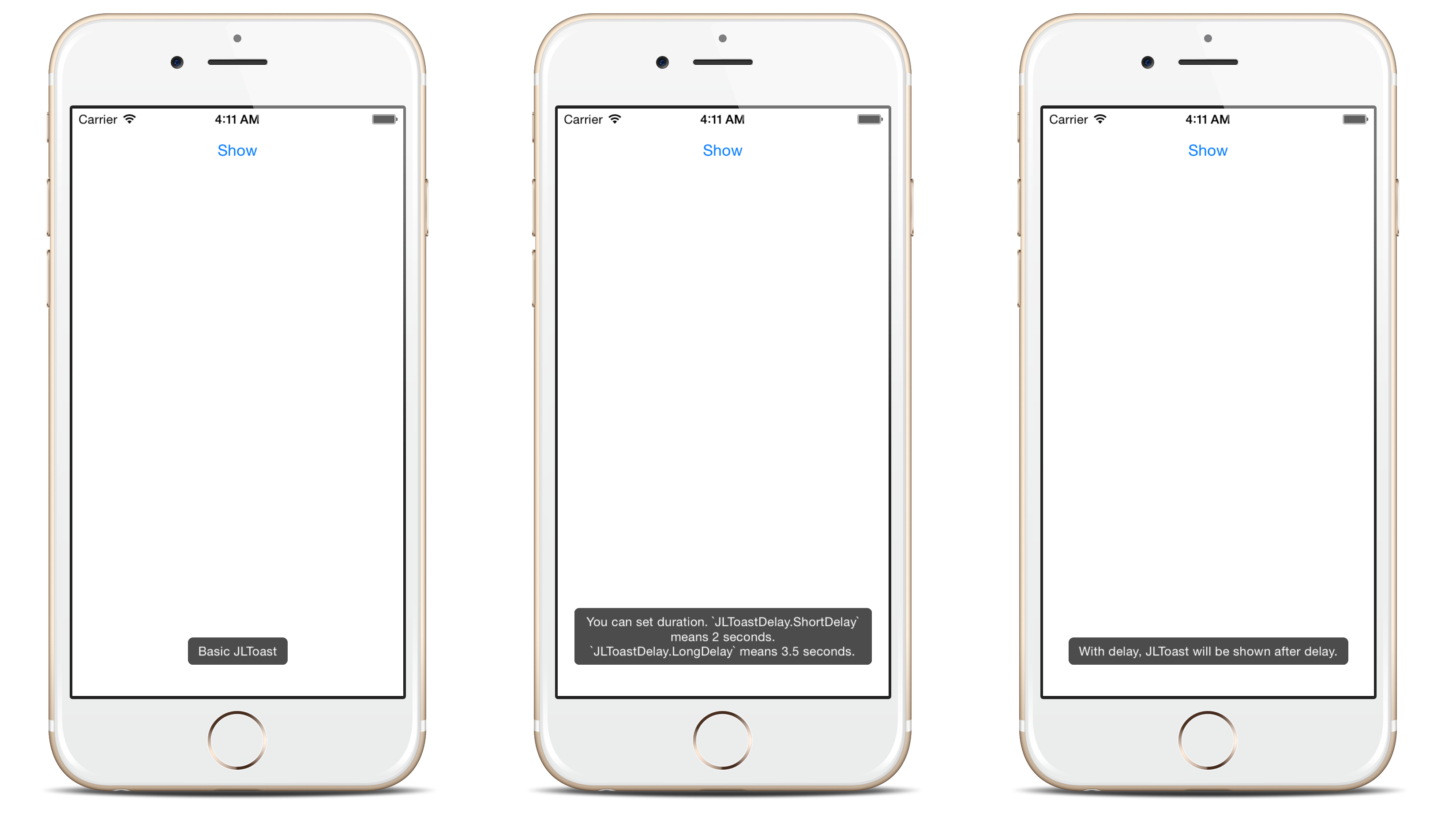
Screenshots
Features
- Queueing: Centralized toast center manages the toast queue.
- Customizable: See the Appearance section.
- String or AttributedString: Both supported.
- UIAccessibility: VoiceOver support.
At a Glance
                                                import Toaster
Toast(text: “Hello, world!”).show()
Installation
For iOS 9+ projects with CocoaPods:
pod ‘Toaster’
For iOS 9+ projects with Carthage:
github “devxoul/Toaster”
For iOS 9+ and Xcode 11+ projects with Swift Package Manager:
                                                dependencies: [

.package(url: “https://github.com/devxoul/Toaster.git”, from: “master”)

]
Getting Started
Setting Duration and Delay
                                                Toast(text: “Hello, world!”, duration: Delay.long)

Toast(text: “Hello, world!”, delay: Delay.short, duration: Delay.long)
Removing Toasts
Removing toast with reference:
                                                let toast = Toast(text: “Hello”)

toast.show()

toast.cancel() // remove toast immediately
Removing current toast:
                                                if let currentToast = ToastCenter.default.currentToast {

currentToast.cancel()

}
Removing all toasts:
ToastCenter.default.cancelAll()
Appearance
Since Toaster 2.0.0, you can use UIAppearance to set default appearance. This is an short example to set default background color to red.
ToastView.appearance().backgroundColor = .red
Supported appearance properties are:
| Property | Type | Description |
|---|---|---|
backgroundColor |
UIColor |
Background color |
cornerRadius |
CGFloat |
Corner radius |
textInsets |
UIEdgeInsets |
Text inset |
textColor |
UIColor |
Text color |
font |
UIFont |
Font |
bottomOffsetPortrait |
CGFloat |
Vertical offfset from bottom in portrait mode |
bottomOffsetLandscape |
CGFloat |
Vertical offfset from bottom in landscape mode |
shadowPath |
CGPath |
The shape of the layer’s shadow |
shadowColor |
UIColor |
The color of the layer’s shadow |
shadowOpacity |
Float |
The opacity of the layer’s shadow |
shadowOffset |
CGSize |
The offset (in points) of the layer’s shadow |
shadowRadius |
CGFloat |
The blur radius (in points) used to render the layer’s shadow |
maxWidthRatio |
CGFloat |
The width ratio of toast view in window |
useSafeAreaForBottomOffset |
Bool |
A Boolean value that determines safeAreaInsets.bottom is added to bottomOffset |
Attributed string
Since Toaster 2.3.0, you can also set an attributed string:
Toast(attributedText: NSAttributedString(string: “AttributedString Toast”, attributes: [NSAttributedString.Key.backgroundColor: UIColor.yellow]))
Accessibility
By default, VoiceOver with UIAccessibility is enabled since Toaster 2.3.0. To disable it:
ToastCenter.default.isSupportAccessibility = false
GitHub
#ios #swift #toast
YOU MIGHT ALSO LIKE...

- August 27, 2025
- SwiftUI
This package provides you with an easy way to show tooltips over any SwiftUI view, since Apple does not provide ...
- August 27, 2025
- SwiftUI
- Uncategorized
SimpleToast is a simple, lightweight, flexible and easy to use library to show toasts / popup notifications inside iOS or ...
- August 27, 2025
- SwiftUI
Create Toast Views with Minimal Effort in SwiftUI Using SSToastMessage. SSToastMessage enables you to effortlessly add toast notifications, alerts, and ...

- August 27, 2025
- Mins Read
- August 27, 2025
- Mins Read
- August 27, 2025
- Mins Read
- August 22, 2025
- Mins Read
