


- August 28, 2025
- Mins Read
A Swift based implementation of the Android Snackbar for iOS
Gif
About
TTGSnackbar is useful for showing a brief message at bottom or top of the screen with one or two action buttons. It appears above all other elements on screen.
It disappears after a timeout or after user click the action button.
Installation
Swift 5
Version 1.9.0+ Xcode 9+ iOS 8+
Swift 4
Version 1.6.0 Xcode 9
iOS 8+
Swift 3
Version 1.5.3 Xcode 8
iOS 8+
CocoaPods
You can use CocoaPods to install TTGSnackbar by adding it to your Podfile:
pod “TTGSnackbar”
Carthage
You can use Carthage to install TTGSnackbar by adding it to your Cartfile:
github “zekunyan/TTGSnackbar”
Import
And you need to import the module.
import TTGSnackbar
Usage
Show a simple message
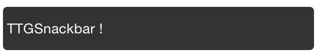
                                                let snackbar = TTGSnackbar(message: “TTGSnackbar !”, duration: .short)

snackbar.show()
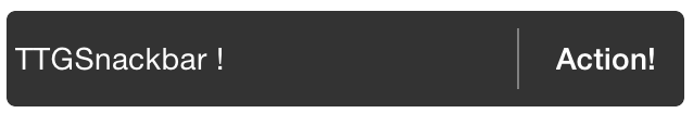
Show a simple message with an action button
                                                let snackbar = TTGSnackbar(

message: “TTGSnackBar !”,

duration: .middle,

actionText: “Action!”,

actionBlock: { (snackbar) in

print(“Click action!”)

}

)

snackbar.show()
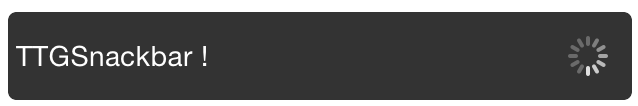
Show a simple message with a long running action
                                                let snackbar = TTGSnackbar(

message: “TTGSnackbar !”,

duration: .forever,

actionText: “Action”,

actionBlock: { (snackbar) in

print(“Click action!”)

// Dismiss manually after 3 seconds

DispatchQueue.main.asyncAfter(deadline: DispatchTime.now() + Double(Int64(3 * Double(NSEC_PER_SEC))) / Doubl(NSEC_PER_SEC)) {

snackbar.dismiss()

}

}

)

snackbar.show()
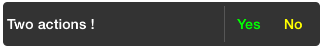
Show a simple message with two action buttons
                                                let snackbar = TTGSnackbar(message: “Two actions !”, duration: .long)
// Action 1

snackbar.actionText = “Yes”

snackbar.actionTextColor = UIColor.green

snackbar.actionBlock = { (snackbar) in NSLog(“Click Yes !”) }
// Action 2

snackbar.secondActionText = “No”

snackbar.secondActionTextColor = UIColor.yellow

snackbar.secondActionBlock = { (snackbar) in NSLog(“Click No !”) }
snackbar.show()
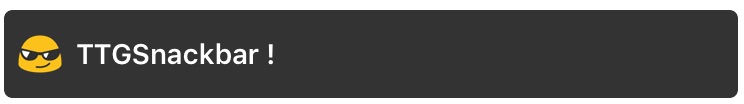
Show a simple message with an icon image
                                                let snackbar = TTGSnackbar(message: “TTGSnackbar !”, duration: .long)
// Add icon image

snackbar.icon = UIImage(named: “emoji_cool_small”)
snackbar.show()
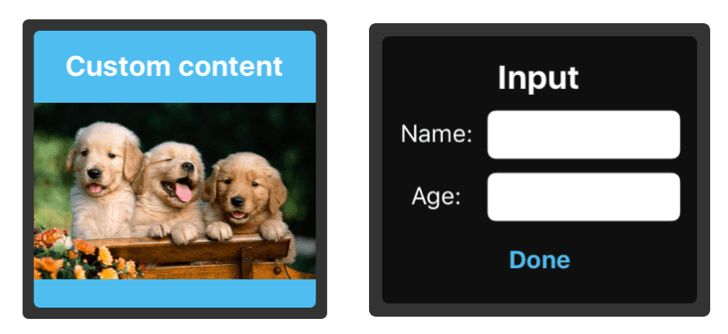
[Improved!] Show custom content view in snackbar
                                                // Instantiate the custom content view

let customContentView = UINib(nibName: “CustomView”, bundle:Bundle.main).instantiate(withOwner: nil, options: nil).first as! UIView?
// Initialize the snackbar with the custom content view

let snackbar = TTGSnackbar(customContentView: customContentView, duration: .long)
snackbar.show()
Make use of the Gesture recognizers in snackbar
                                                let snackbar = TTGSnackbar(message: “TTGSnackbar !”, duration: .long)
// Add icon image

snackbar.icon = UIImage(named: “emoji_cool_small”)
// Add the gesture recognizer callbacks

ssnackbar.onTapBlock = { snackbar in

snackbar.dismiss()

}
snackbar.onSwipeBlock = { (snackbar, direction) in
// Change the animation type to simulate being dismissed in that direction

if direction == .right {

snackbar.animationType = .slideFromLeftToRight

} else if direction == .left {

snackbar.animationType = .slideFromRightToLeft

} else if direction == .up {

snackbar.animationType = .slideFromTopBackToTop

} else if direction == .down {

snackbar.animationType = .slideFromTopBackToTop

}
snackbar.dismiss()

}
snackbar.show()
[New!] Automatic handling of Showing one Snackbar at a time
TTGSnackbarManager can handle automatically showing and replacing the presented Snackbars at your screen.
Usage
Swift
                                                let snackbar = TTGSnackbar(message: “TTGSnackbar !”, duration: .long)

TTGSnackbarManager.show(snackbar)
Objective – C
                                                TTGSnackbar *bar = [[TTGSnackbar alloc] initWithMessage:@”Bar1″ duration:TTGSnackbarDurationMiddle];

[bar setDismissBlock:^(TTGSnackbar * snackBar) {

//whatever you want for dismiss

}];

[[TTGSnackbarManager shared] showSnackbar: bar];
TTGSnackbarManager uses the dismissBlock property of a snackbar, it does not replace any functionality that you add to the snackbar, rather it just adds its own code to the existing block.
Customization
Message
message: String defines the message to display. Supports multi line text. Supports updating on the fly.
Message text color
messageTextColor: UIColor defines the message text color.
Message text font
messageTextFont: UIFont defines the message text font.
Display duration
duration: TTGSnackbarDurationdefines the display duration.
TTGSnackbarDuration : short, middle, long and forever. When you set forever, the snackbar will show an activity indicator after user click the action button and you must dismiss the snackbar manually.
Action title
actionText: String defines the action button title.
Action title color
actionTextColor: UIColor defines the action button title color.
Action title font
actionTextFont: UIFont defines the action button title font.
Action max width
actionMaxWidth: CGFloat defines the action button max width. Min is 44.
Action text number of lines
actionTextNumberOfLines: Int defines the number of lines of action button title. Default is 1.
Action callback
actionBlock: TTGActionBlock? will be called when user clicks the action button.
                                                // TTGActionBlock definition.

public typealias TTGActionBlock = (snackbar: TTGSnackbar) -> Void
Second action title, color, font and callback
                                                secondActionText: String

secondActionTextColor: UIColor

secondActionTextFont: UIFont

secondActionBlock: TTGActionBlock?
Snackbar MaxWidth
snackbarMaxWidth: CGFloat will set the max width of the snackbar if on larger devices you don not want it full width. Default is -1 which is denotes full-width.
Dismiss callback
dismissBlock: TTGDismissBlock? will be called when snackbar dismiss automatically or when user click action button to dismiss the snackbar.
                                                // TTGDismissBlock definition.

public typealias TTGDismissBlock = (snackbar: TTGSnackbar) -> Void
On Tap Gesture callback
onTapBlock: TTGActionBlock will be called when the user taps the snackbar.
                                                // TTGActionBlock definition.

public typealias TTGActionBlock = (snackbar: TTGSnackbar) -> Void
On Swipe Gesture callback
onSwipeBlock: TTGSwipeBlock will be called when the user swipes on the snackbar
                                                /// Swipe gesture callback closure

public typealias TTGSwipeBlock = (_ snackbar: TTGSnackbar, _ direction: UISwipeGestureRecognizerDirection) -> Void
Auto Dismissal using Swipe Gestures
shouldDismissOnSwipe: Bool will determine if the snackbar will automatically be dismissed when it’s swiped
                                                /// A property to make the snackbar auto dismiss on Swipe Gesture

public var shouldDismissOnSwipe: Bool = false
Animation type
animationType: TTGSnackbarAnimationType defines the style of snackbar when it show and dismiss.
TTGSnackbarAnimationType : fadeInFadeOut, slideFromBottomToTop, slideFromBottomBackToBottom, slideFromLeftToRight, slideFromRightToLeft, slideFromTopToBottom and slideFromTopBackToTop.
The default value of animationType is slideFromBottomBackToBottom, which is the same as Snackbar in Android.
Animation duration
animationDuration: NSTimeInterval defines the duration of show and hide animation.
Margins
leftMargin: CGFloat, rightMargin: CGFloat, topMargin: CGFloat and bottomMargin: CGFloat defines the margins of snackbar
[New!] Custom Content View to follow left and right margins
shouldActivateLeftAndRightMarginOnCustomContentView: Bool will activate the left and right margins if using a customContentView
                                                /// a property to enable left and right margin when using customContentView

public var shouldActivateLeftAndRightMarginOnCustomContentView: Bool = false
Padding (Content inset)
contentInset: UIEdgeInsets defines the padding(content inset) of content in the snackbar. Default is UIEdgeInsets.init(top: 0, left: 4, bottom: 0, right: 4).
Corner radius
cornerRadius: CGFloat defines the corner radius of snackbar.
Icon image
icon: UIImage defines the icon image.
Icon image content mode
iconContentMode: UIViewContentMode defines the content mode of icon imageView.
[New!] Custom container view
containerView: UIView defines the custom container(super) view for snackbar to show.
[New!] Custom content view
customContentView: UIView? defines the custom content view to show in the snackbar.
[New!] Separator line view background color
separateViewBackgroundColor: UIColor = UIColor.gray defines the separator line color.
ActivityIndicatorViewStyle
activityIndicatorViewStyle: UIActivityIndicatorViewStyle defines the activityIndicatorViewStyle in snackbar.
ActivityIndicatorView color
activityIndicatorViewColor: UIColor defines the activityIndicatorView color in snackbar.
Animation SpringWithDamping
animationSpringWithDamping: CGFloat defines the spring animation damping value. Default is 0.7.
Animation initialSpringVelocity
animationInitialSpringVelocity: CGFloat defines the spring animation initial velocity. Default is 5.
GitHub
#animation #carthage #ios #snackbar #swift
YOU MIGHT ALSO LIKE...

- August 27, 2025
- SwiftUI
This package provides you with an easy way to show tooltips over any SwiftUI view, since Apple does not provide ...
- August 27, 2025
- SwiftUI
- Uncategorized
SimpleToast is a simple, lightweight, flexible and easy to use library to show toasts / popup notifications inside iOS or ...
- August 27, 2025
- SwiftUI
Create Toast Views with Minimal Effort in SwiftUI Using SSToastMessage. SSToastMessage enables you to effortlessly add toast notifications, alerts, and ...

- August 27, 2025
- Mins Read
- August 27, 2025
- Mins Read
- August 27, 2025
- Mins Read
- August 22, 2025
- Mins Read
